Walking the City
"explore the city through the act of walking"
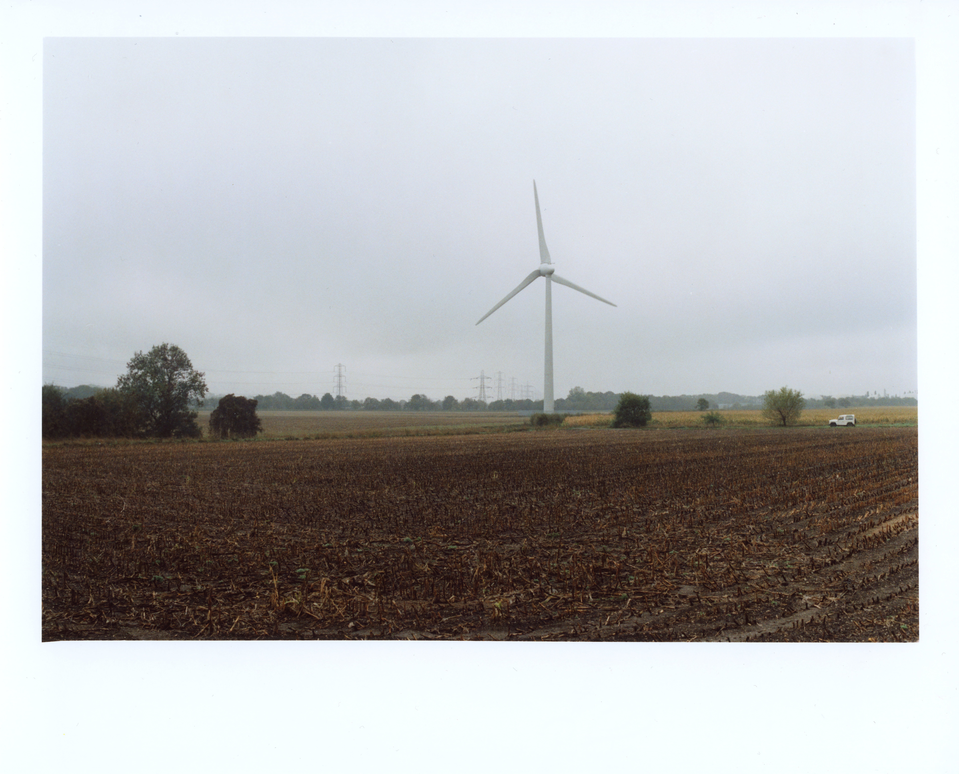
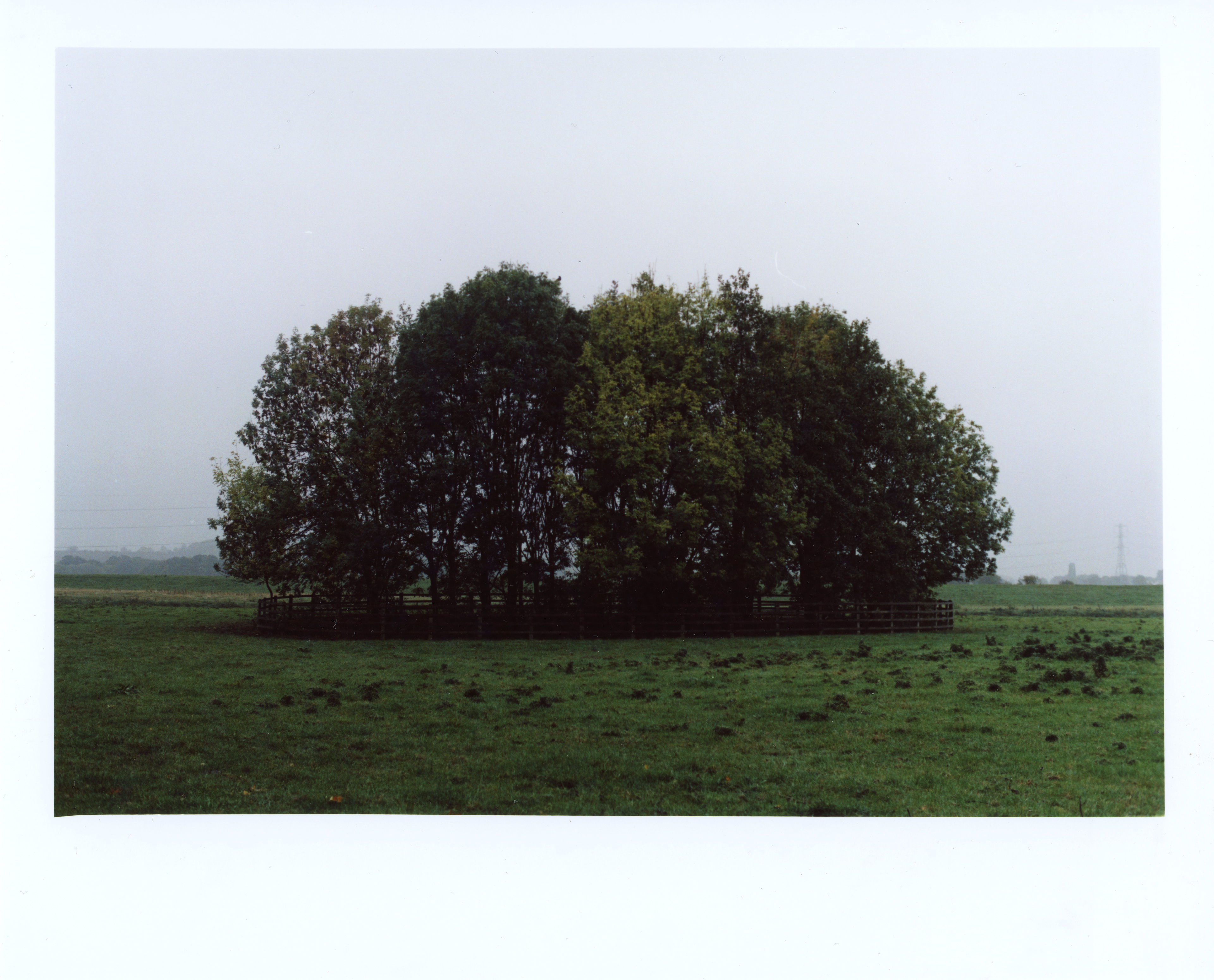
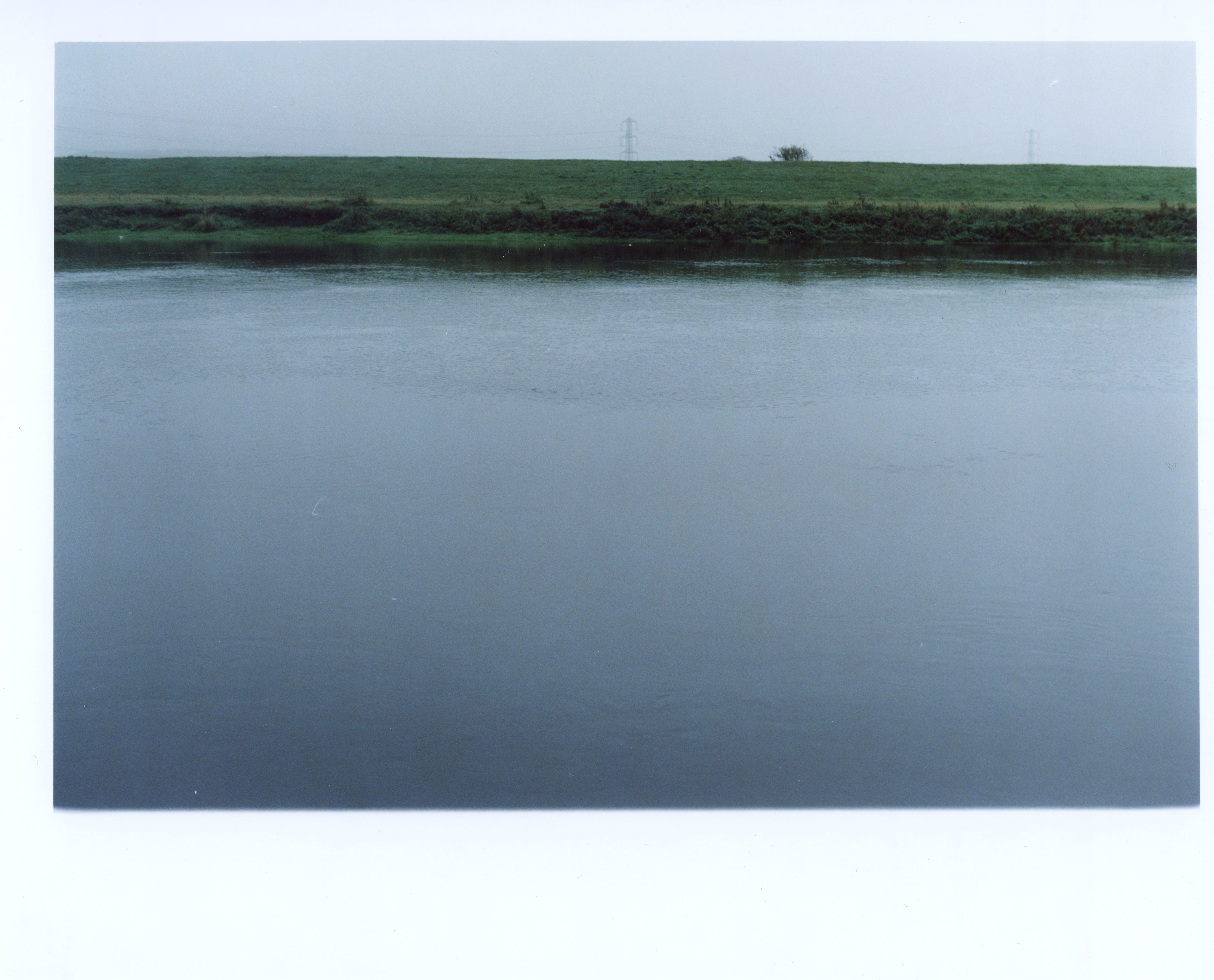
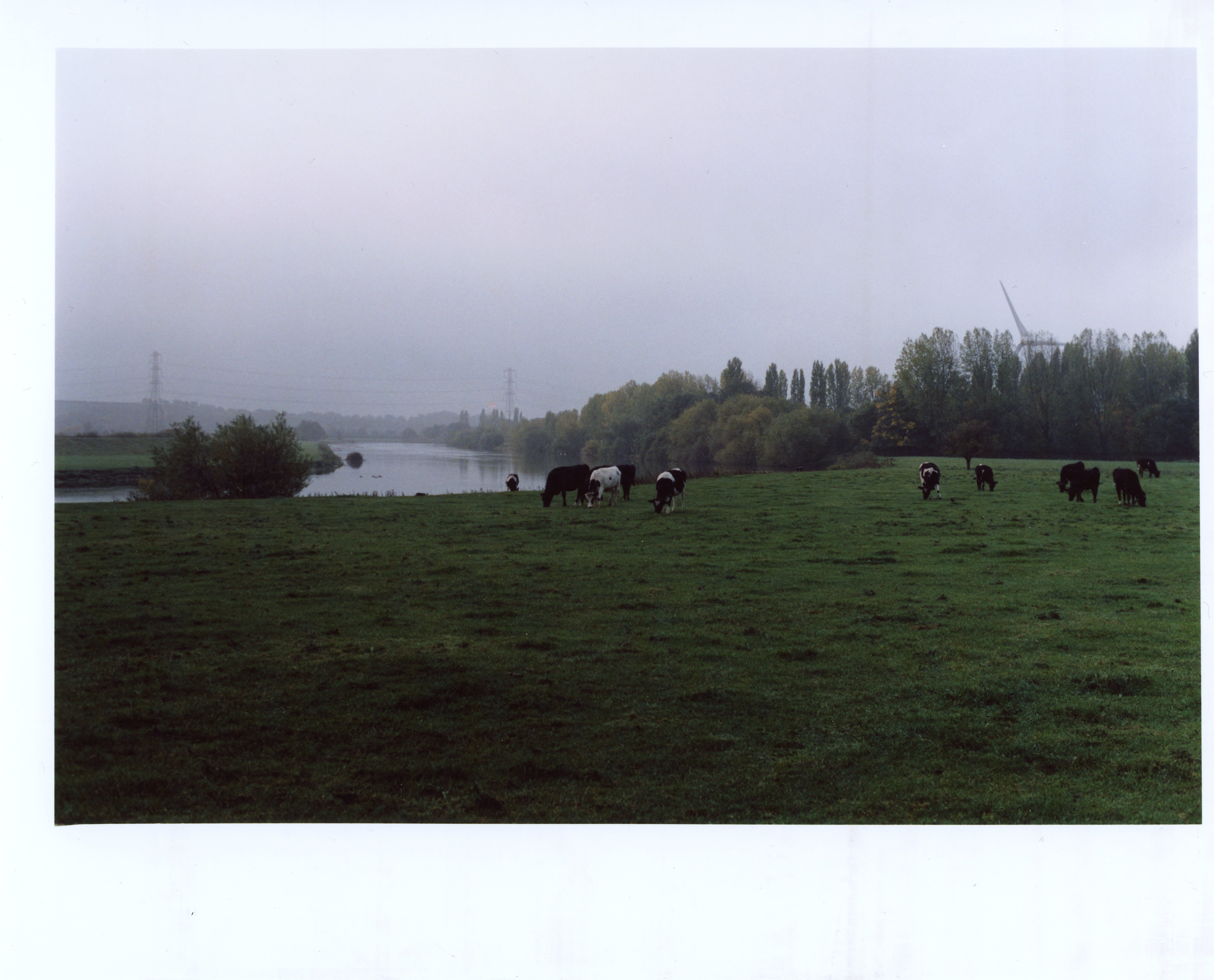
My idea for this brief was to explore a different part of Nottinghamshire called Burton Joyce. I decided on this place because it is a more rural landscape. As I commute to university each day I found myself passing Burton Joyce on the train every time I would have university. I thought it looked like an interesting place so it just seemed right to explore it.
What I planned to do was walk along the river for a small distance and photograph different materials that made up that area such as grass, wood, concrete etc. I wanted to photograph these things and fill the frame with them. I also planned to simply document the views that I saw whilst I was there. I decided to use film for this as I wanted to gain some more practice using film and thought it would give the images a more timeless look.
Below are a few of the images I took and printed them in the colour darkroom.
The prints above are not accurate representations of the prints themselves as they are scanned in on a generic printer/scanner.
I did really enjoy the process of shooting on film and printing them in the darkroom. It was great to actually print the images from the negatives themselves. I think that the images came out quite well considering this was my first time shooting with colour film. I believe they do represent Burton Joyce as these are what I believe makes up Burton Joyce: the animals (cows), the river, small patches of trees, farmland and the wind turbine. I see these things every time I pass Burton Joyce on the train. Of course there are plenty of other things that make up the landscape but to me this is how I see Burton Joyce.
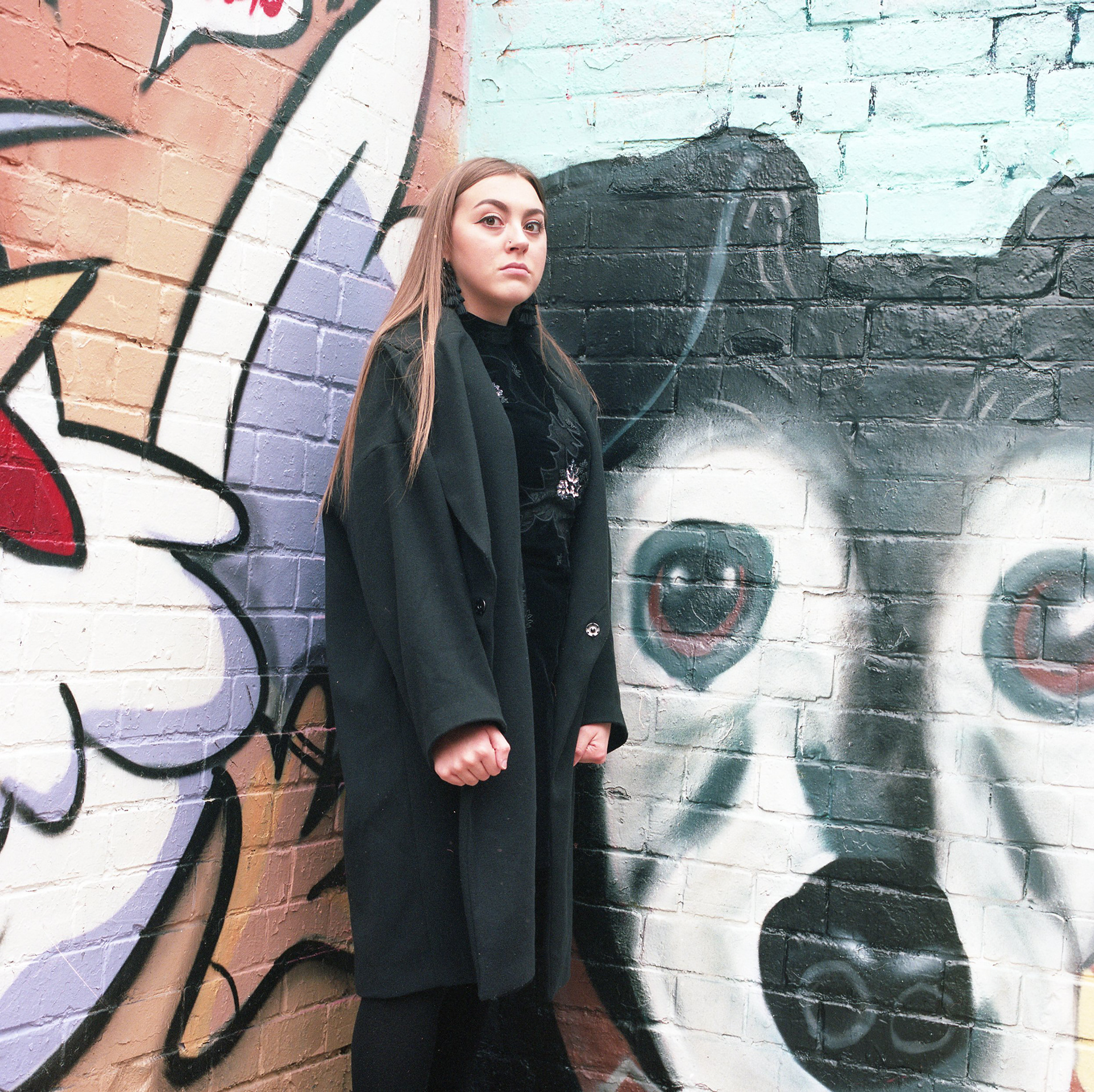
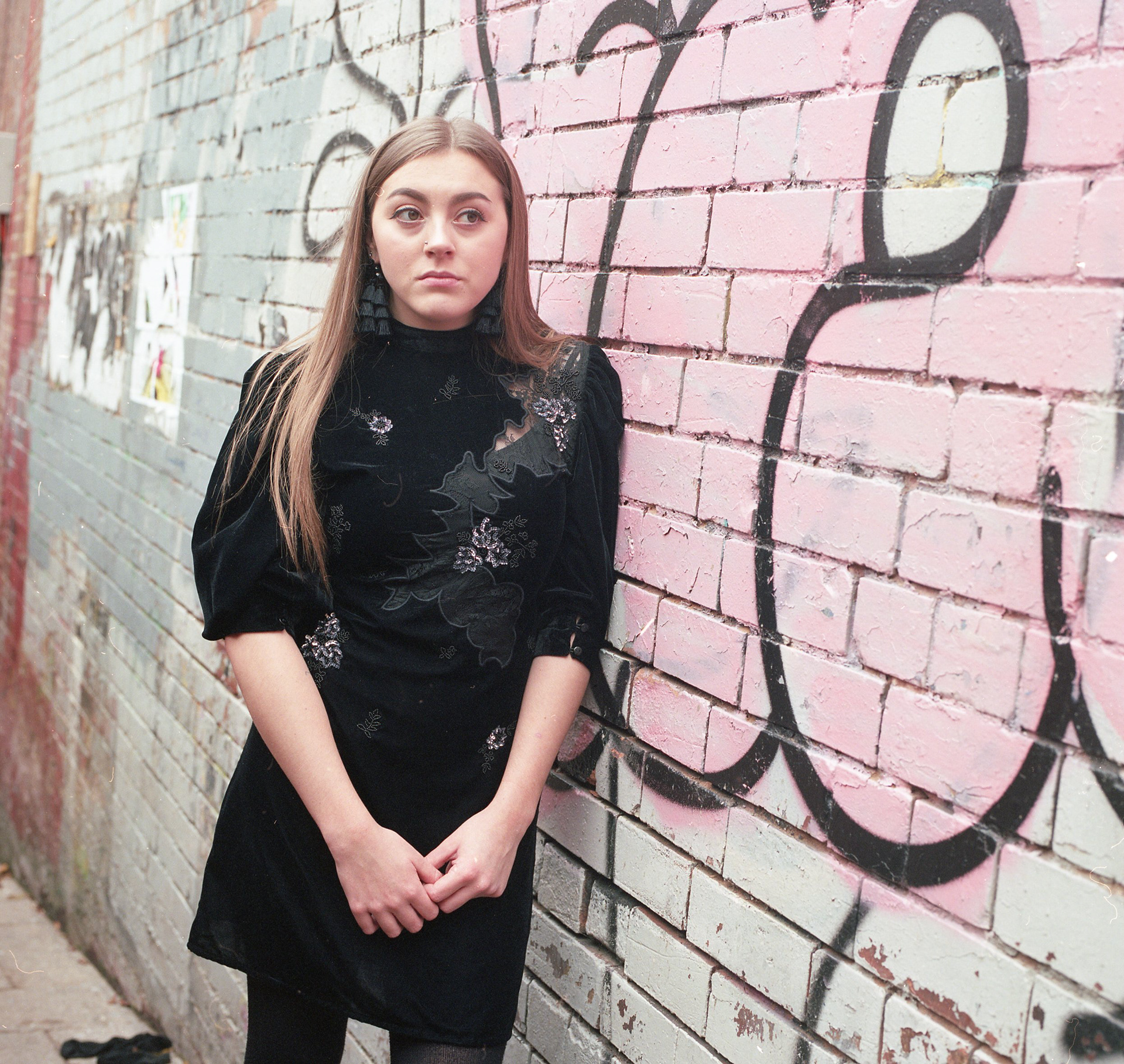
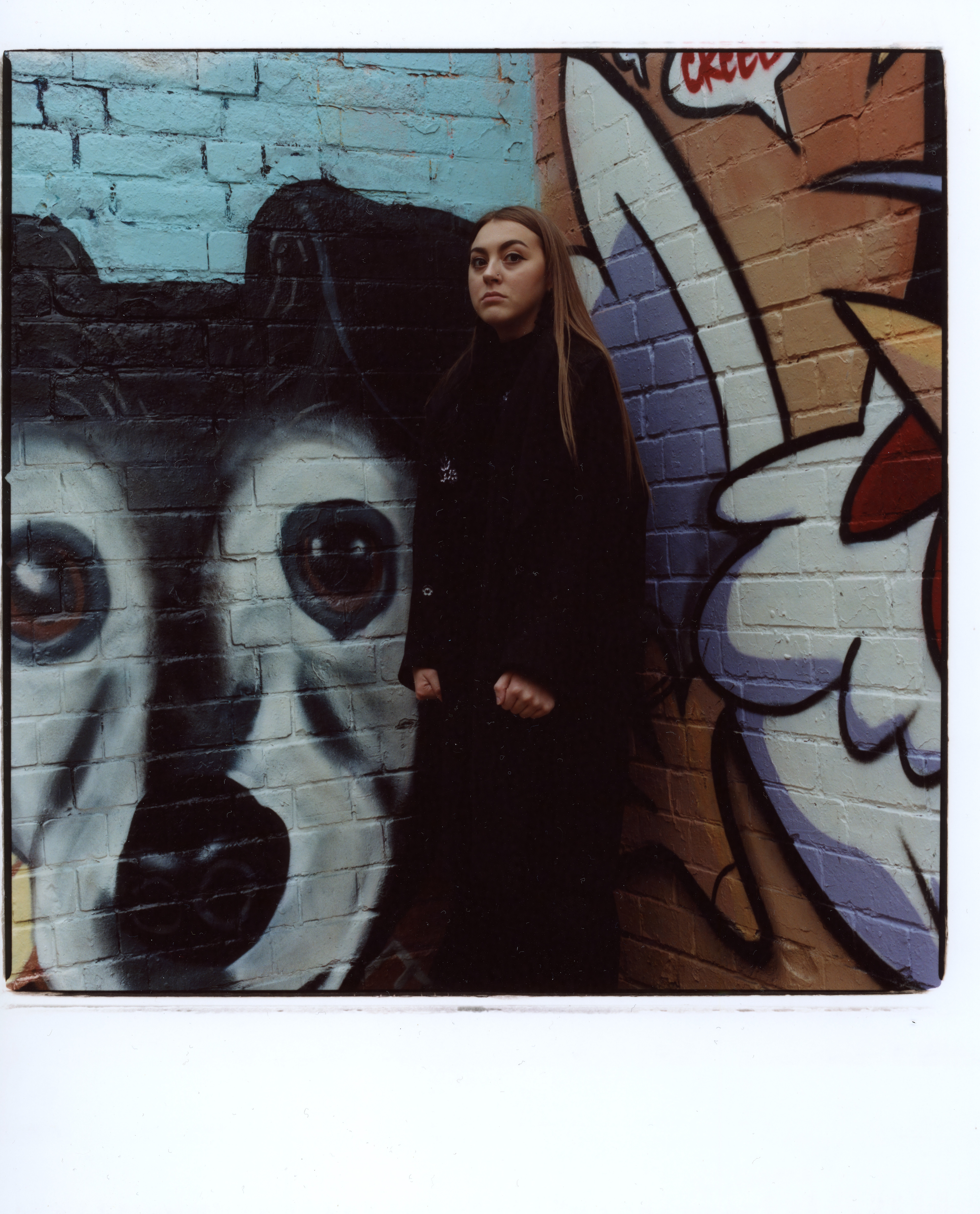
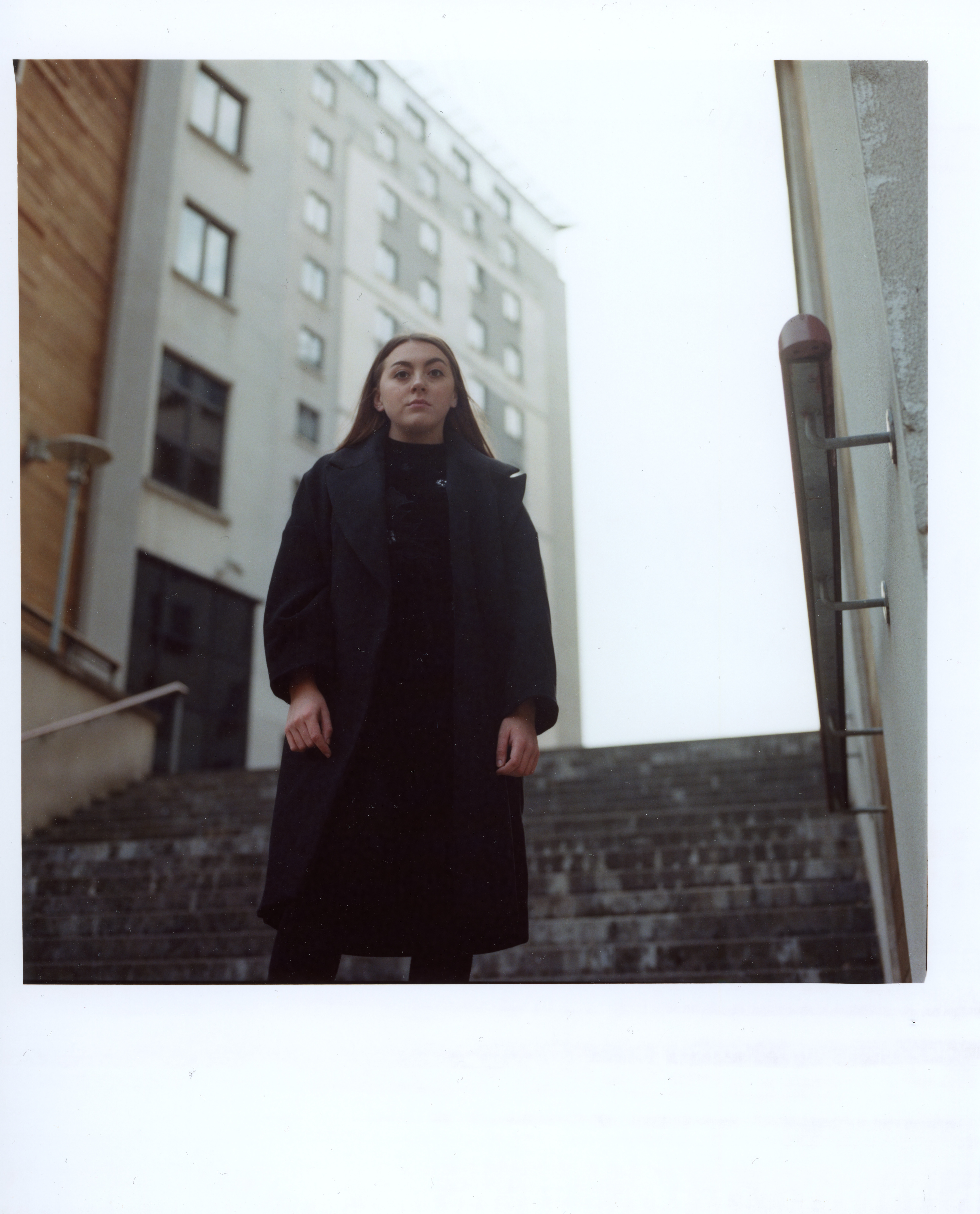
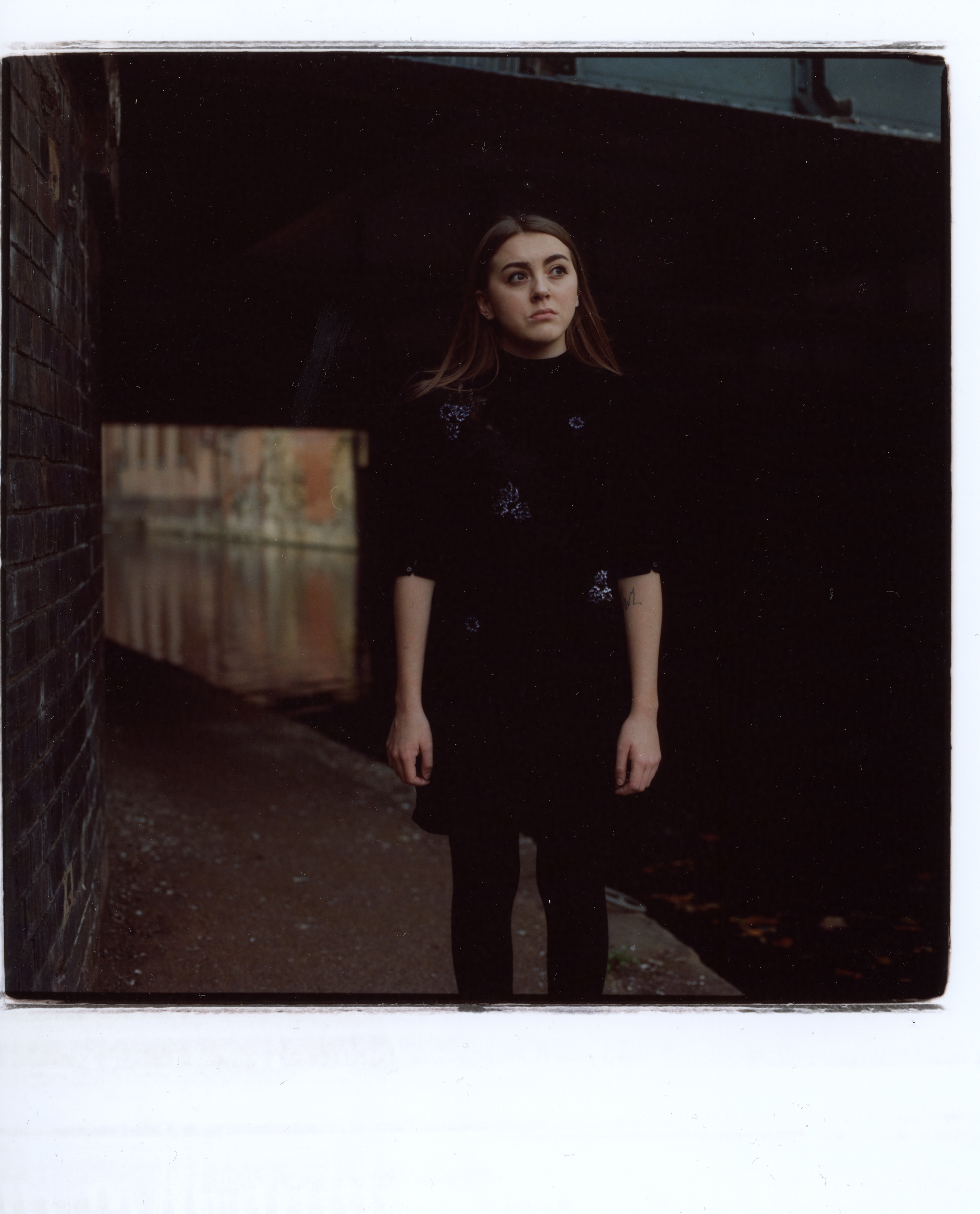
Testing & Workshops
Over the past few weeks I have taken part in a couple of workshops to increase my skillset and experience with different camera formats such as medium format and large format. Medium format was such a great skill to learn as it really opened my eyes to shooting analog. I definitely prefer shooting medium format than the usual 35mm film format. Personally it is way more fun and more practical as you have to use the ground glass viewfinder and position yourself. I also took part in a large format workshop where we also shot portraits. Again, I really enjoyed this and it was very eye-opening to possible future projects.
Below are a few examples of the medium format portraits I took.
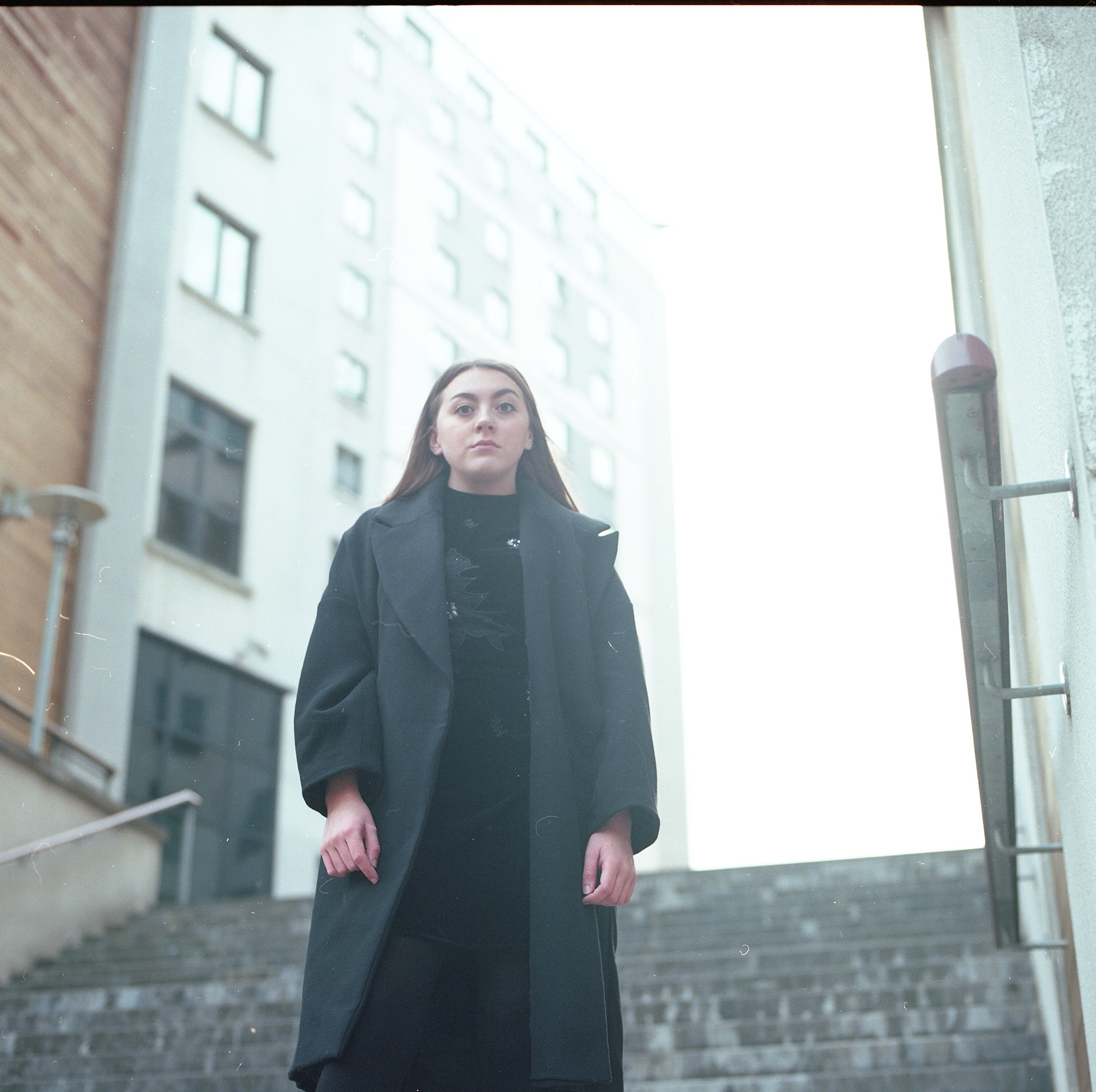
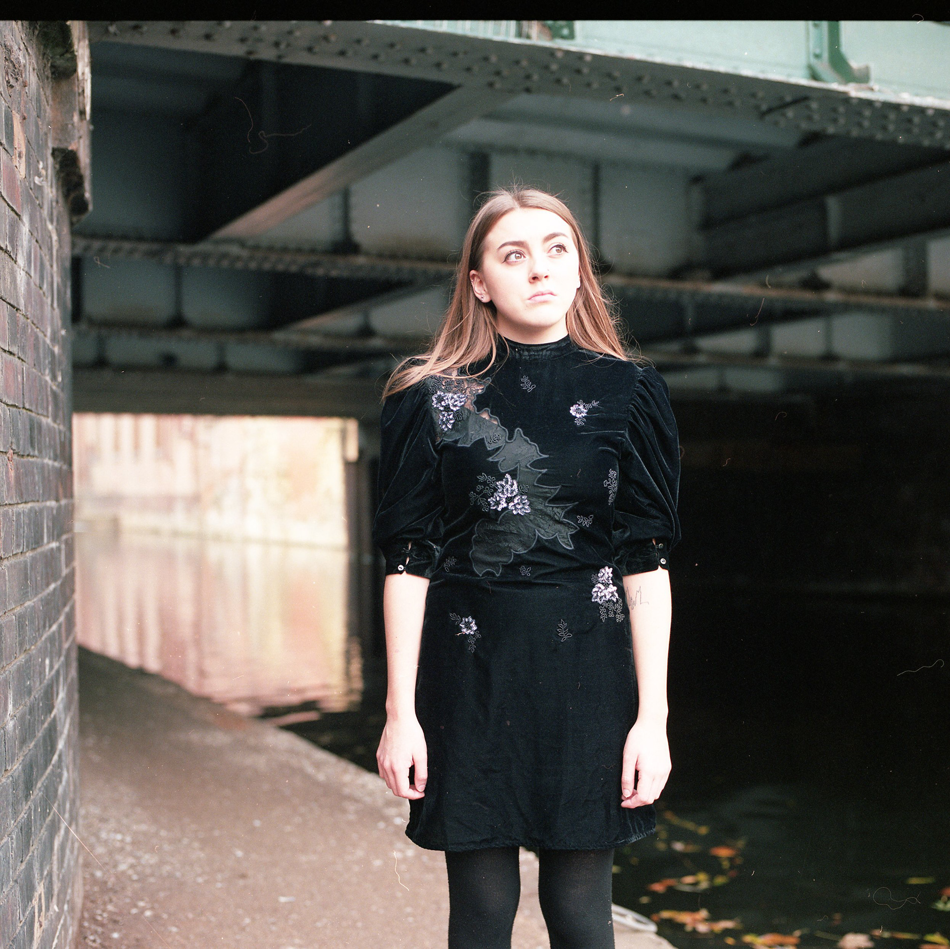
Medium Format Scanned Negatives
Medium Format Darkroom Prints
My Idea
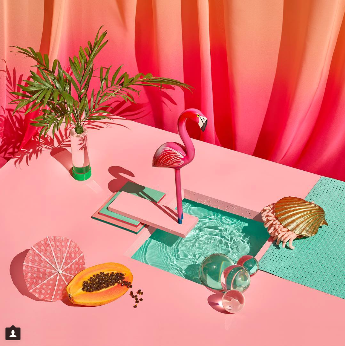
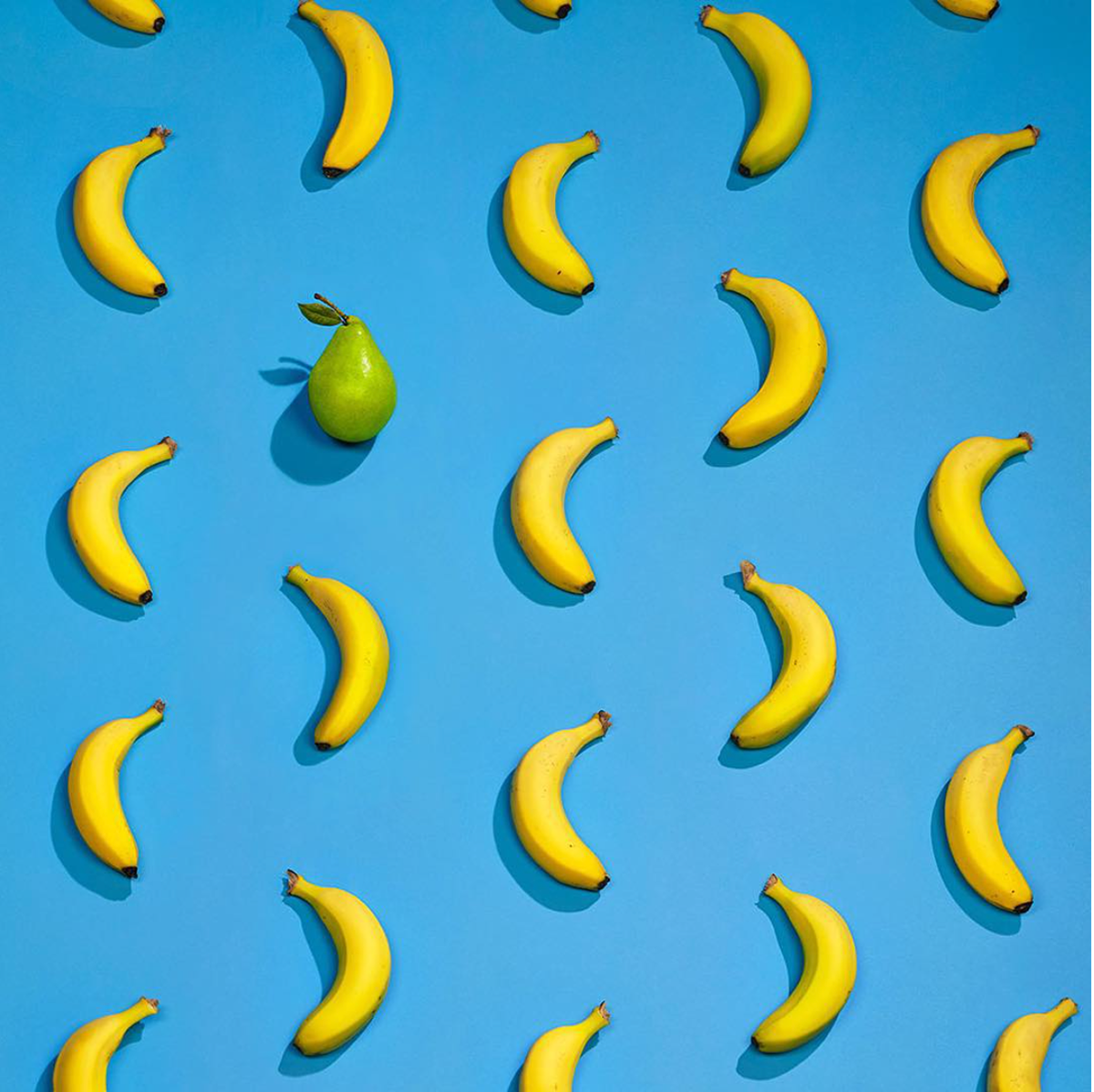
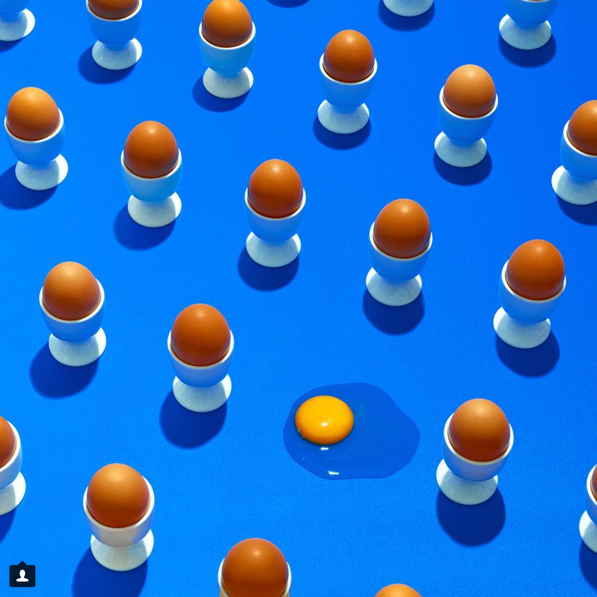
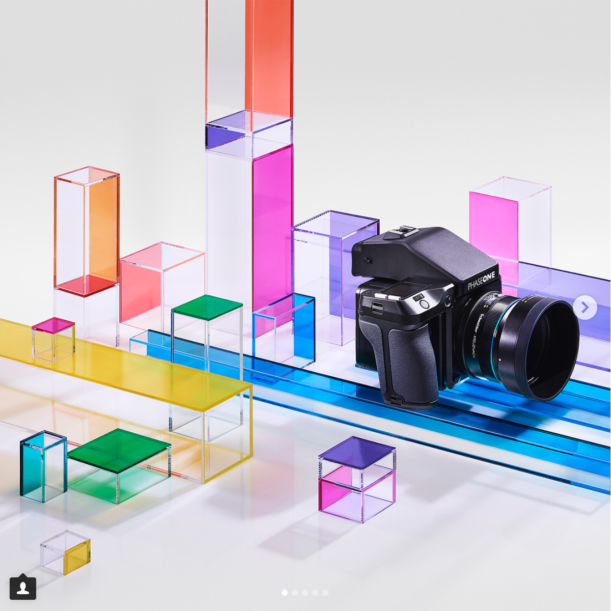
My main idea for the rest of the brief is to focus on studio based still life as I feel most at home in the studio and enjoy it the most. I really like the current trend in still life photography which is bright bold block colours. My usual work is more studio/ retouching based as I love the entire process. Below is a link to a Pinterest page I made for the style of work I want to produce. Below are also a few examples of the style of work I really like at the moment.
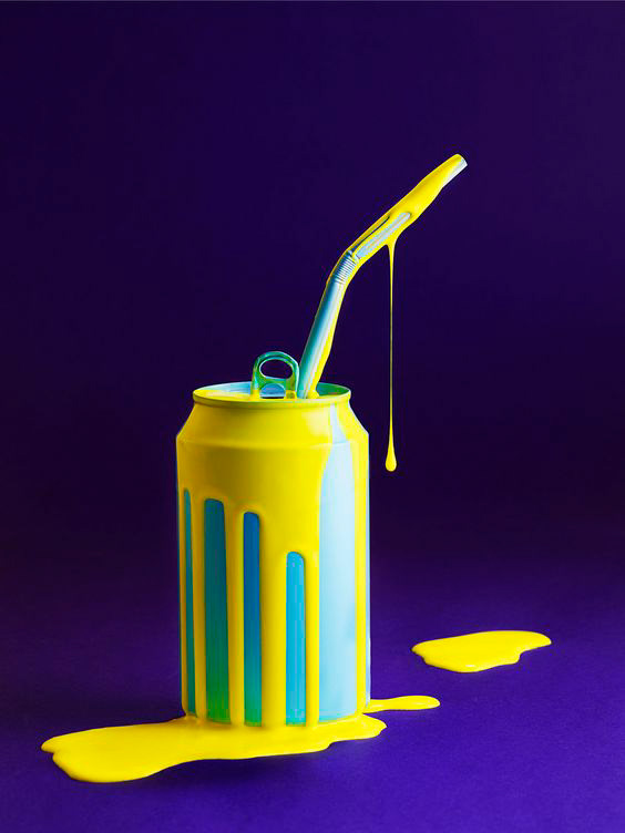
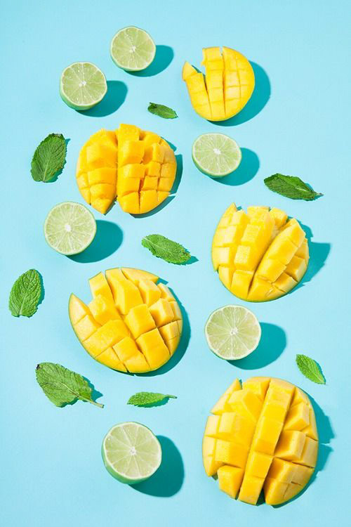
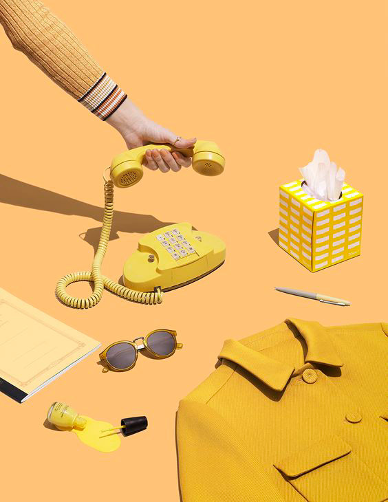
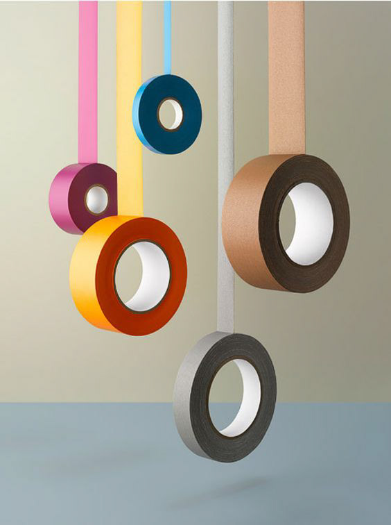
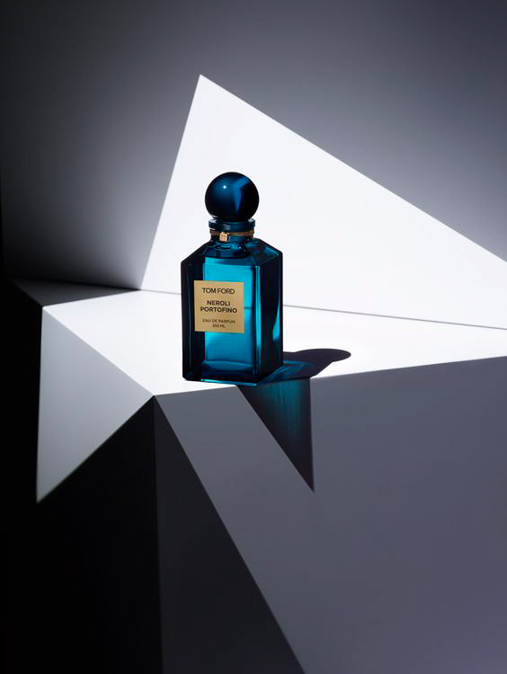
I really love this style of work at the moment because of the bright bold colours. I love how everything is about colour, shape and texture! The colours you choose change an image. For example the middle image is great as it repeats the colour yellow, creating a certain mood and aesthetic. A lot of fashion and beauty advertisement nowadays is shown as flat-lays where it is placed in a certain way.
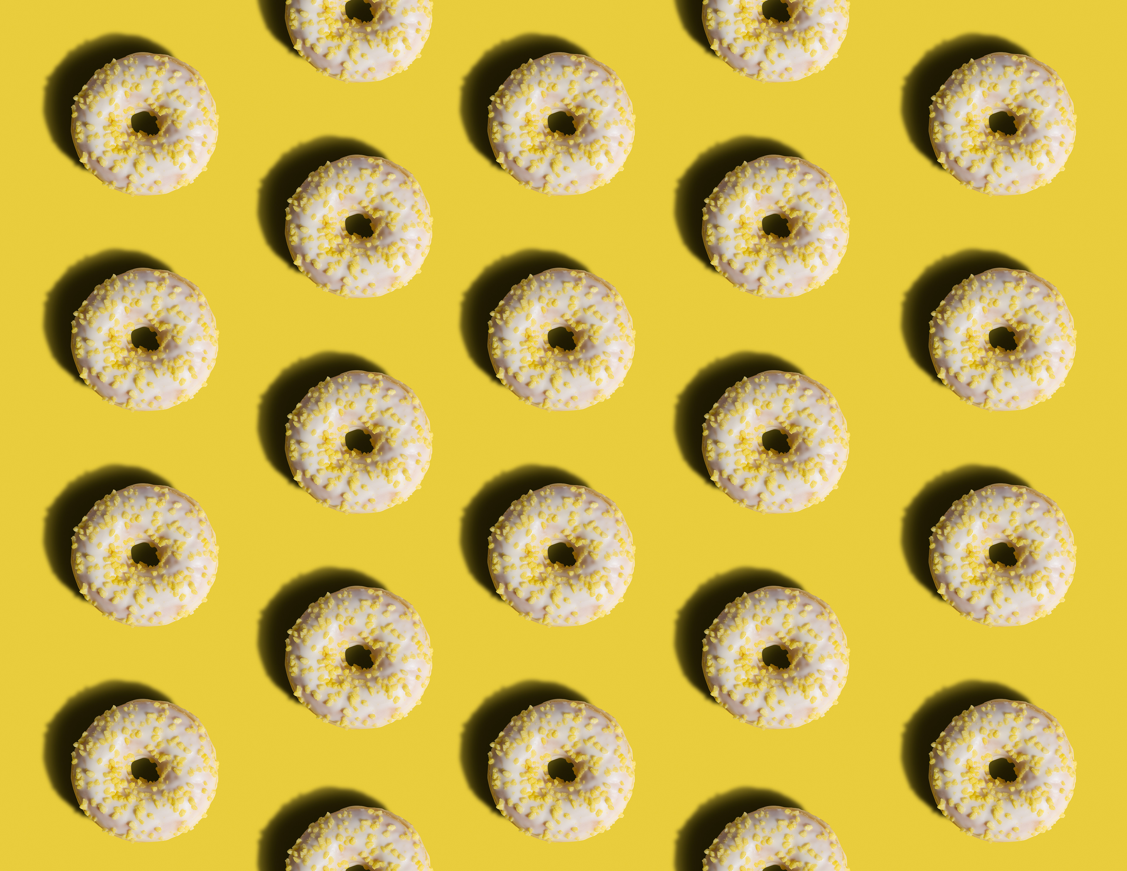
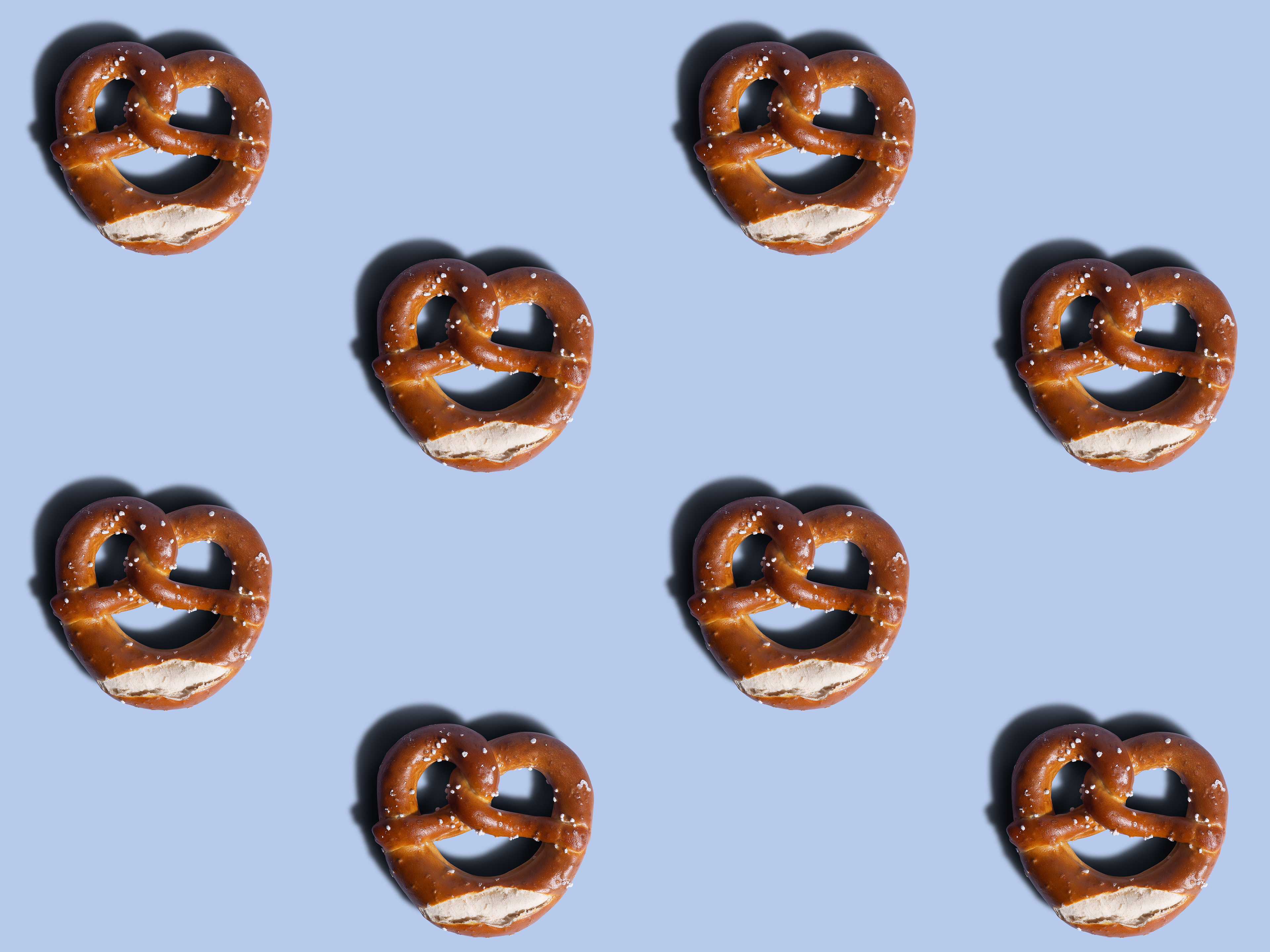
After creating this Pinterest board of the style, I had to somehow link studio work to the brief about 'waking the city'. I decided to do some test shots and the first thing that came to my head was food! I went to a local shop (Lincoln) and bought a donut and pretzel. I decided to jump straight in and attempt to create a similar style of image to the ones on the Pinterest page. So, I grabbed some coloured paper and played around in my studio with some different lighting. I found that one light did the trick. Once I had the shot I took it into Lightroom to make some slight adjustments, then I could take it into Photoshop. Once in Photoshop I cut out the donut and pretzel from the background and placed them on a similar coloured layer to create the clean looking, background with no gradient. However by doing this it removes the harsh shadow which I wanted. So to overcome this I created the shadow myself. I also retouched and airbrushed the food to make it look more pristine. I also experimented by repeating them over and over to create a pattern. Below are the final two images I produced.
After thinking about it, I could link this to the walking brief as I could document some of the local food around the city. I could even document favourite foods from around the city.
An idea to use these for the exhibitions to maybe print these as a wallpaper and stick them to a wall in the exhibition. However, I eventually decided not to go with these images for the exhibition as I still was unsure of the direction I wanted to take as I was out of my comfort zone.
Paloma Rincon
Paloma is a Madrid based photographer working across the globe. Her work incorporates sculpture, design and illustration. She is known for her use of bright colours and contemporary aesthetic.
Below are a few examples of her work.
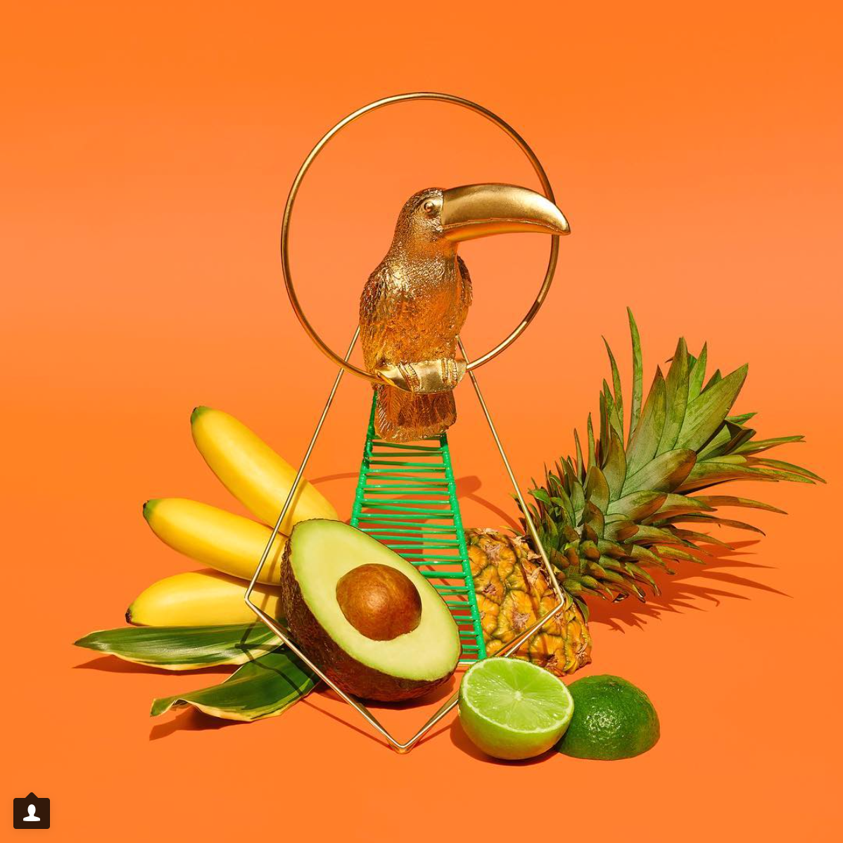
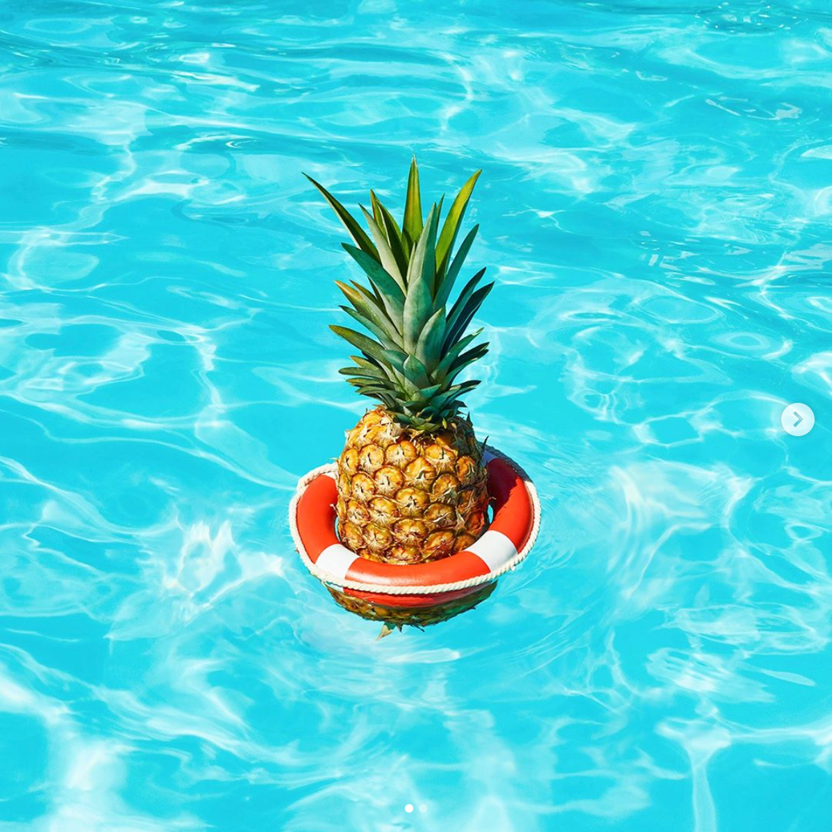
I really like Paloma's work because of the bright bold colours she uses. I like how her images are so clean and crisp. The two images in the top right corner are where I got the idea to photograph the donut and pretzel. I thought I would try it to see if I could create a clean looking image similar to Paloma's. The background on my images was cut out and replaced with a digital colour layer to create a consistent colour across the entire image.
Karl Taylor
Karl is a London based photographer with clients from all over the world. He is best known for his attention to detail and extremely precise control of light.
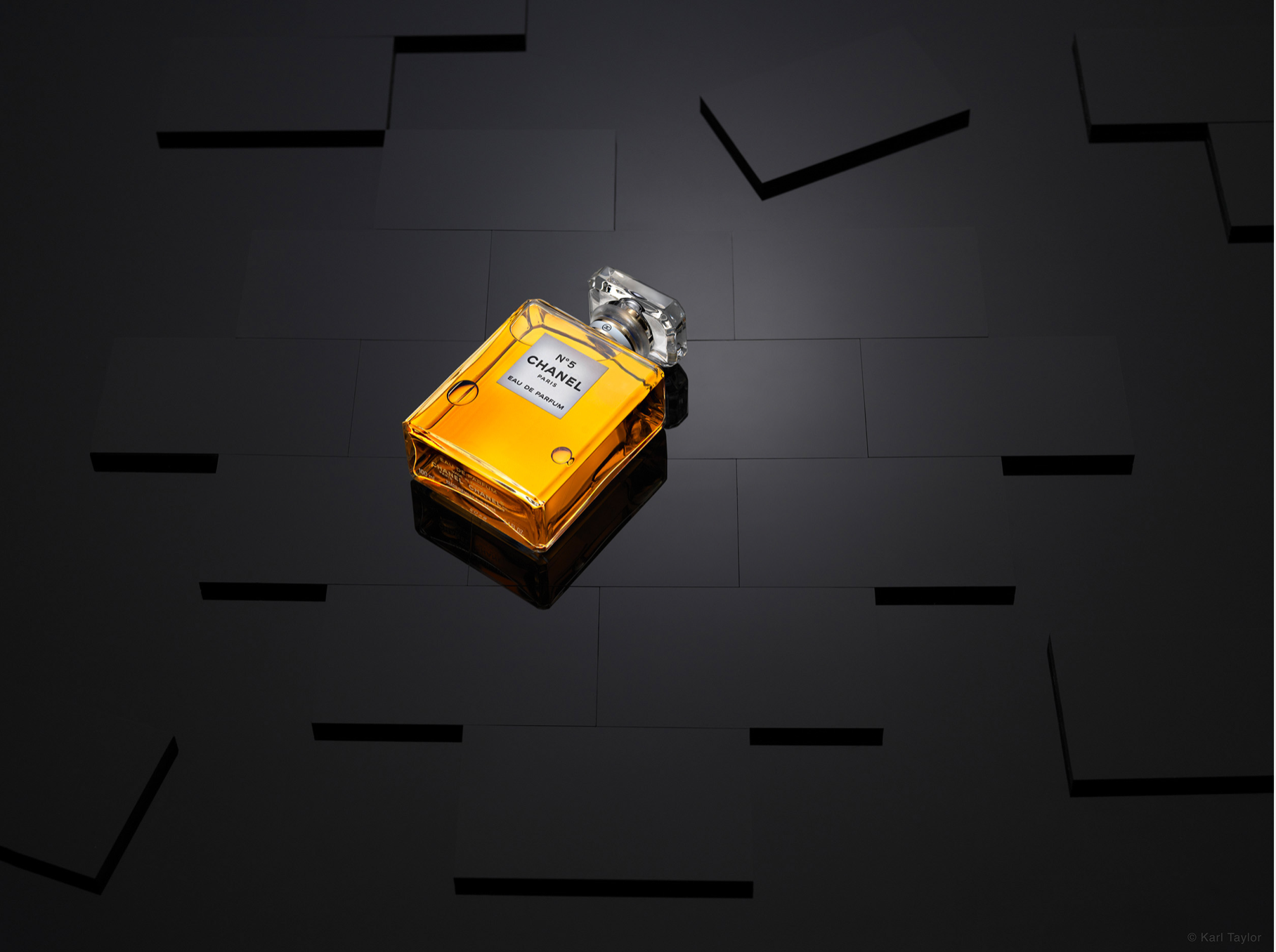
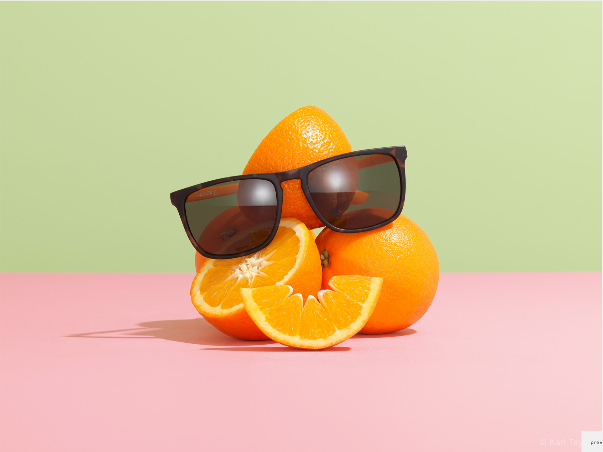
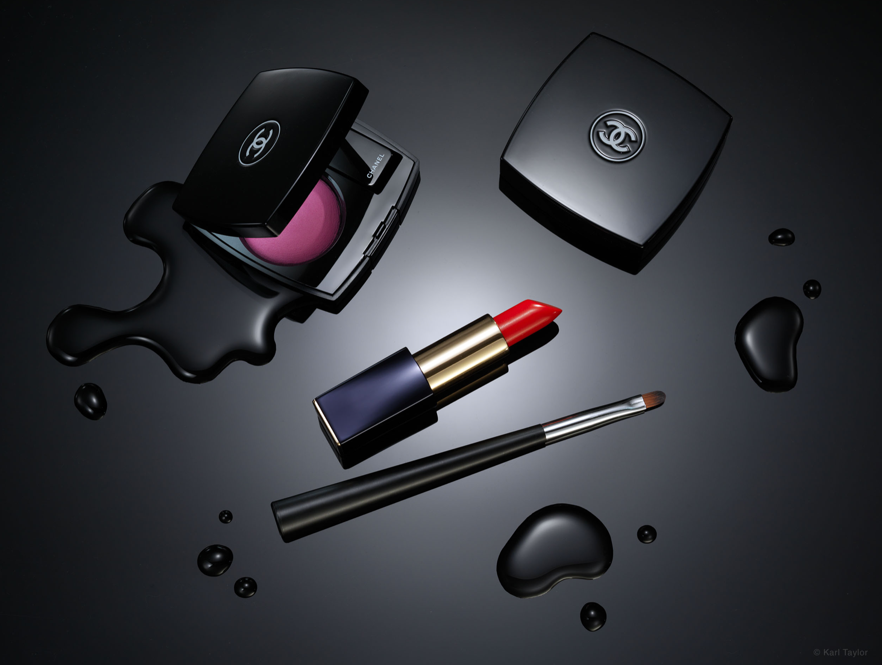
I really like his work because everything he produces is so clean and immaculately retouched. He has a very high-end commercial style and spends hours to simply dress a set and set up his lighting. Below are a few of his images.
Next Idea
After considering the previous images of the donut and pretzel, I thought that they did not really fit with the brief, so I went back to the drawing board to try and come up with some other ideas. I came up with the idea of photographing old vintage colourful medicine bottles that I sourced from an antiques shop in Lincoln. With this idea I had the idea to link Nottingham's history, with medicine and where Boots Pharmacy first began, to a physical, antique medicine bottle. This would allow me to still use the studio and use bright colours as contrasting backgrounds, so I went for it and gave it a try. Here are some results below.
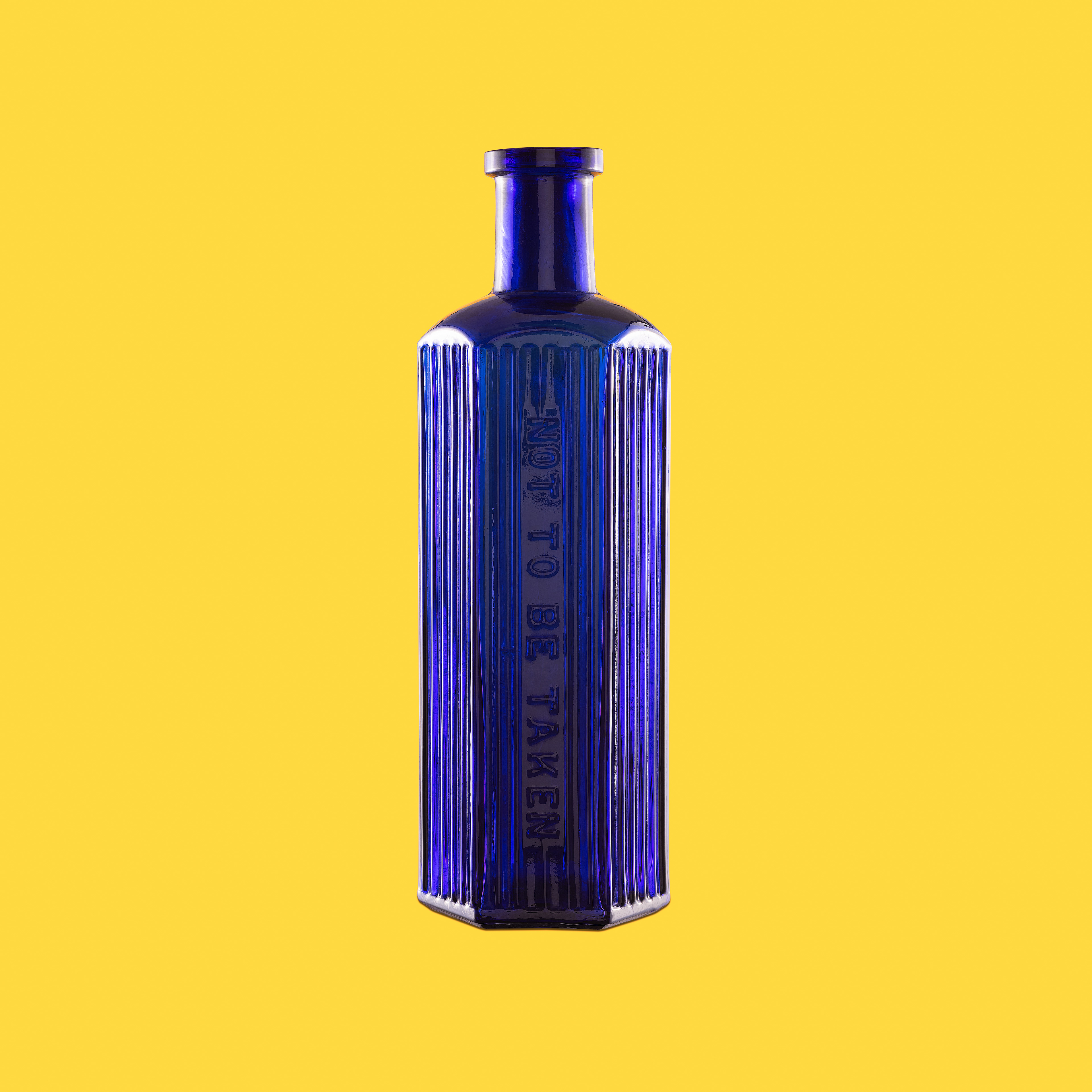
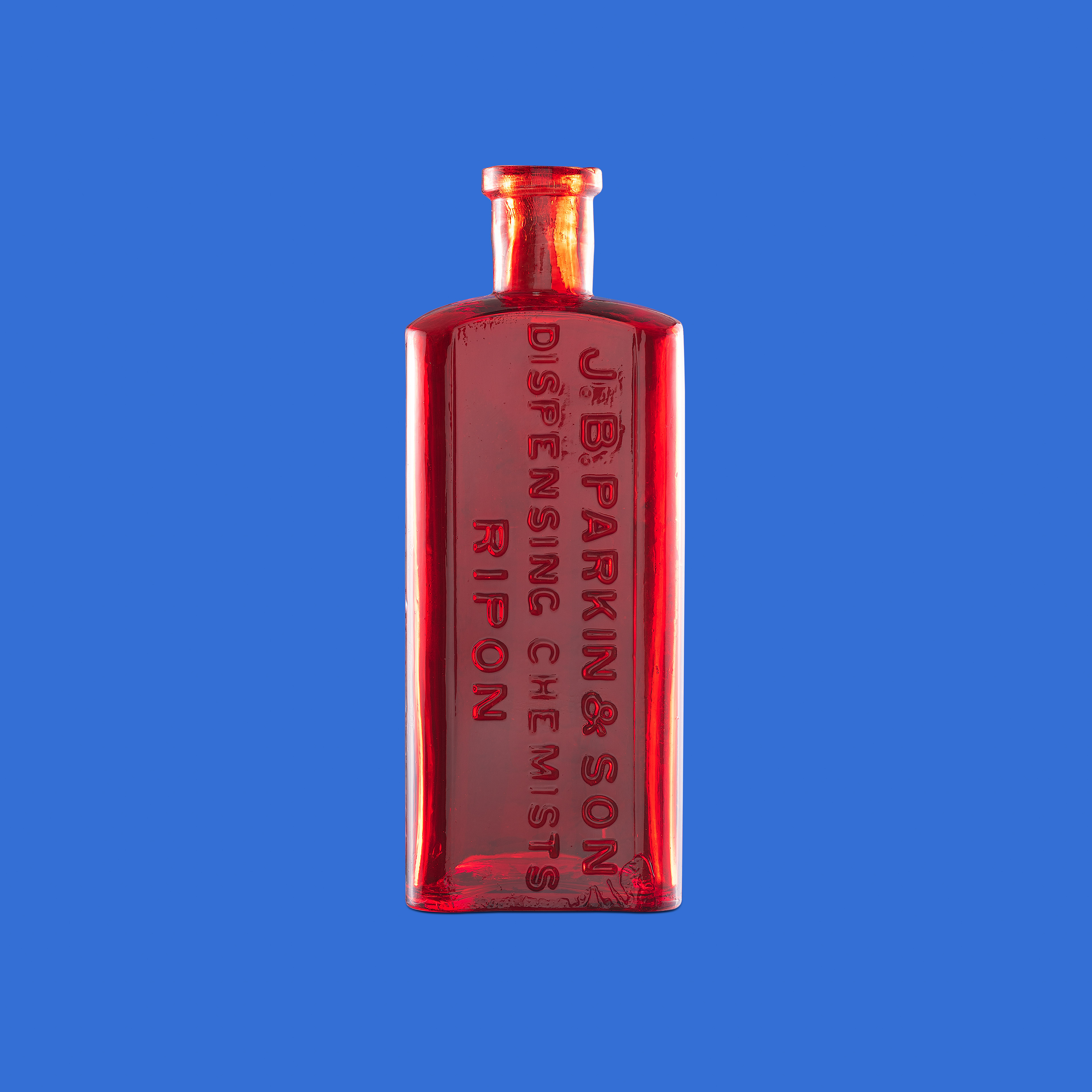
I enjoyed taking and creating these images as they have a sort of pop-art look to them. However I still didn't think they linked to the brief very well and was not happy to show them in the exhibition. So back to the drawing board it was.
Another Idea
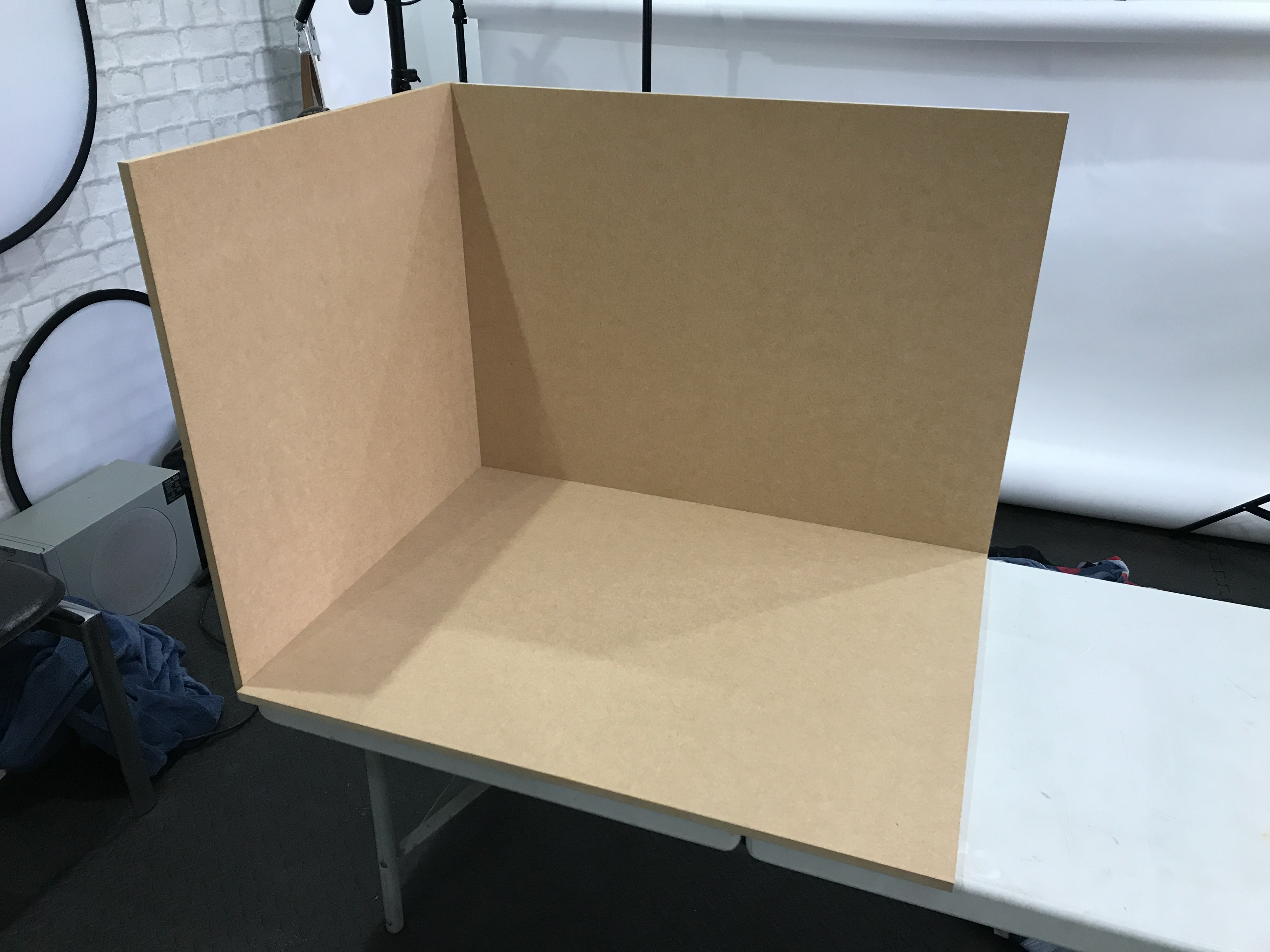
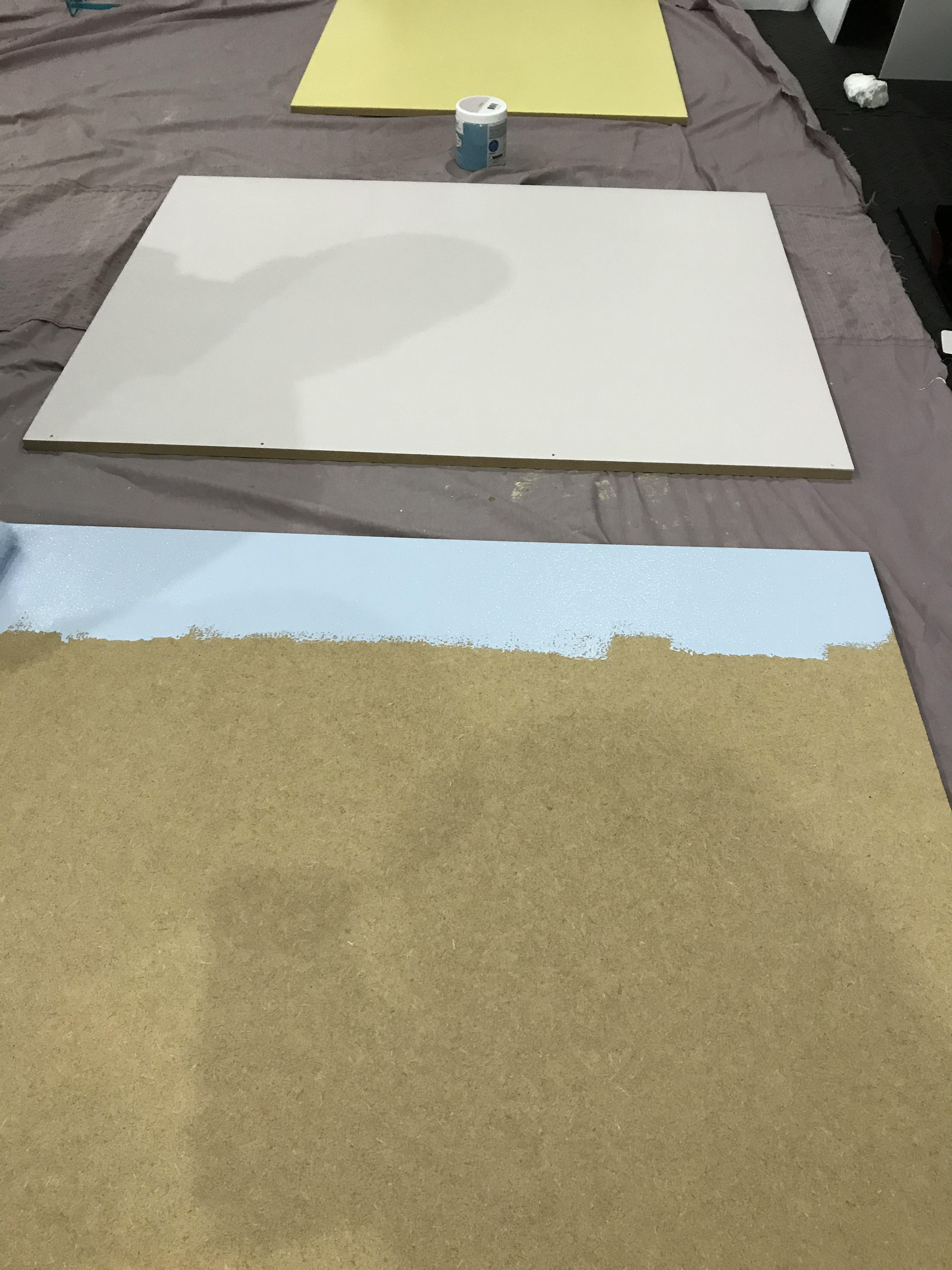
At this stage, I was getting pushed for time as the exhibition was fast approaching and I still was not sure what I was doing for the exhibition itself and what work to show. Over Christmas I decided to try and go back to the type of work I would want to create and try and link it to the brief. So my idea was to take still life image of objects that, I believe make Nottingham, Nottingham to me (in my personal opinion). To do this I built a small still life set from some MDF boards and painted them different colours and then joined them to create a small corner. Below are some images of my building process.
After building the set I decided to create one image as a test and then show it to the class on one of the Monday VP sessions to get some feedback. So my first image was to do the idea about Nottingham being a hotspot for drinking, partying, clubs etc. So I decided to deconstruct an alcoholic drink using its ingredients and some different shaped boards to create visually interesting image. Below is the result.
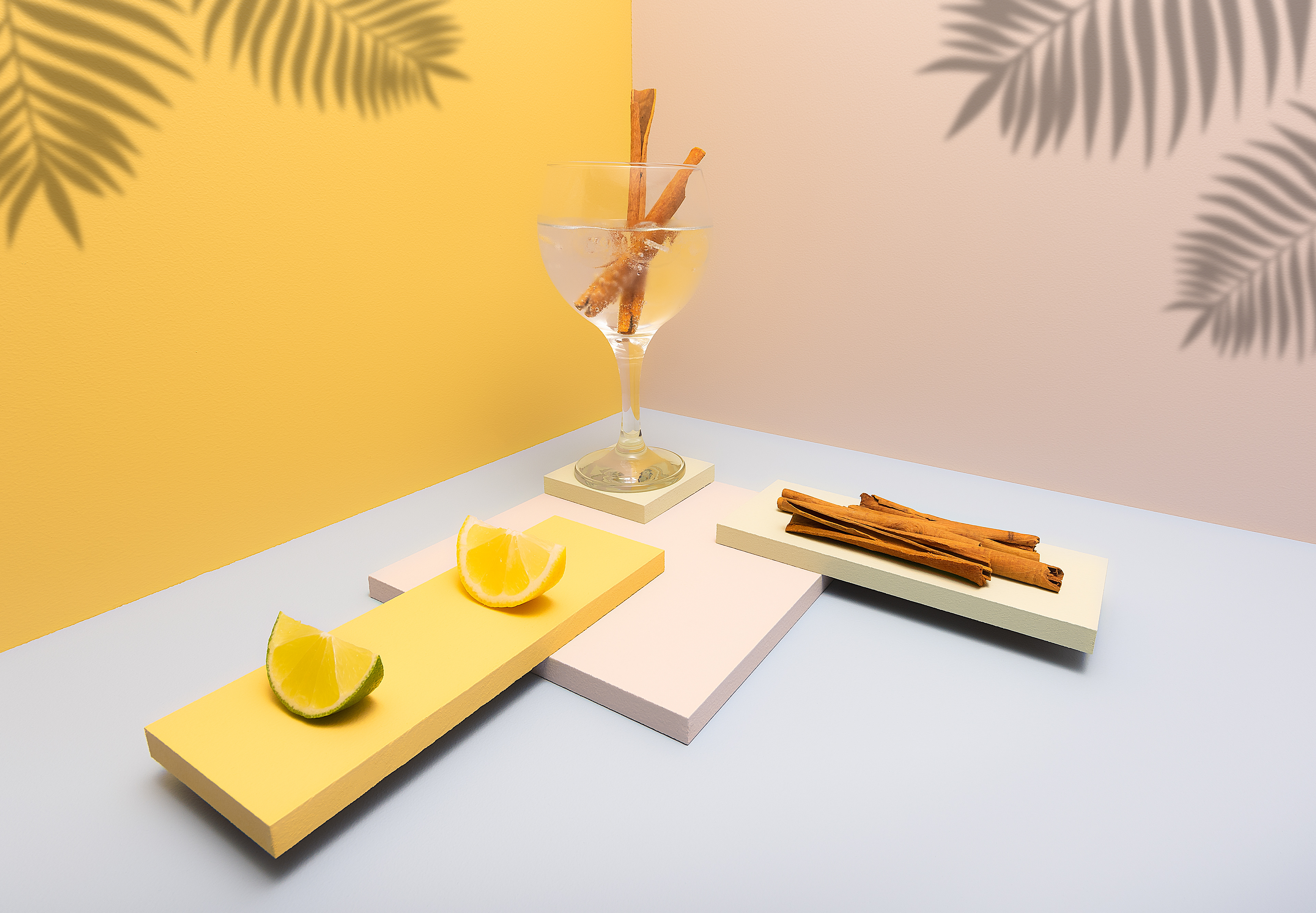
Personally, I do like this image as I feel that it works well to convey the idea that I wanted it to. However I found that by this stage, I did not have enough time to create a few more images to create a series which I could have used for the exhibition as it took so long to set up even for this shoot. It took around 1 hour to set up the props and around 30 minutes to capture a shot.
Final Idea
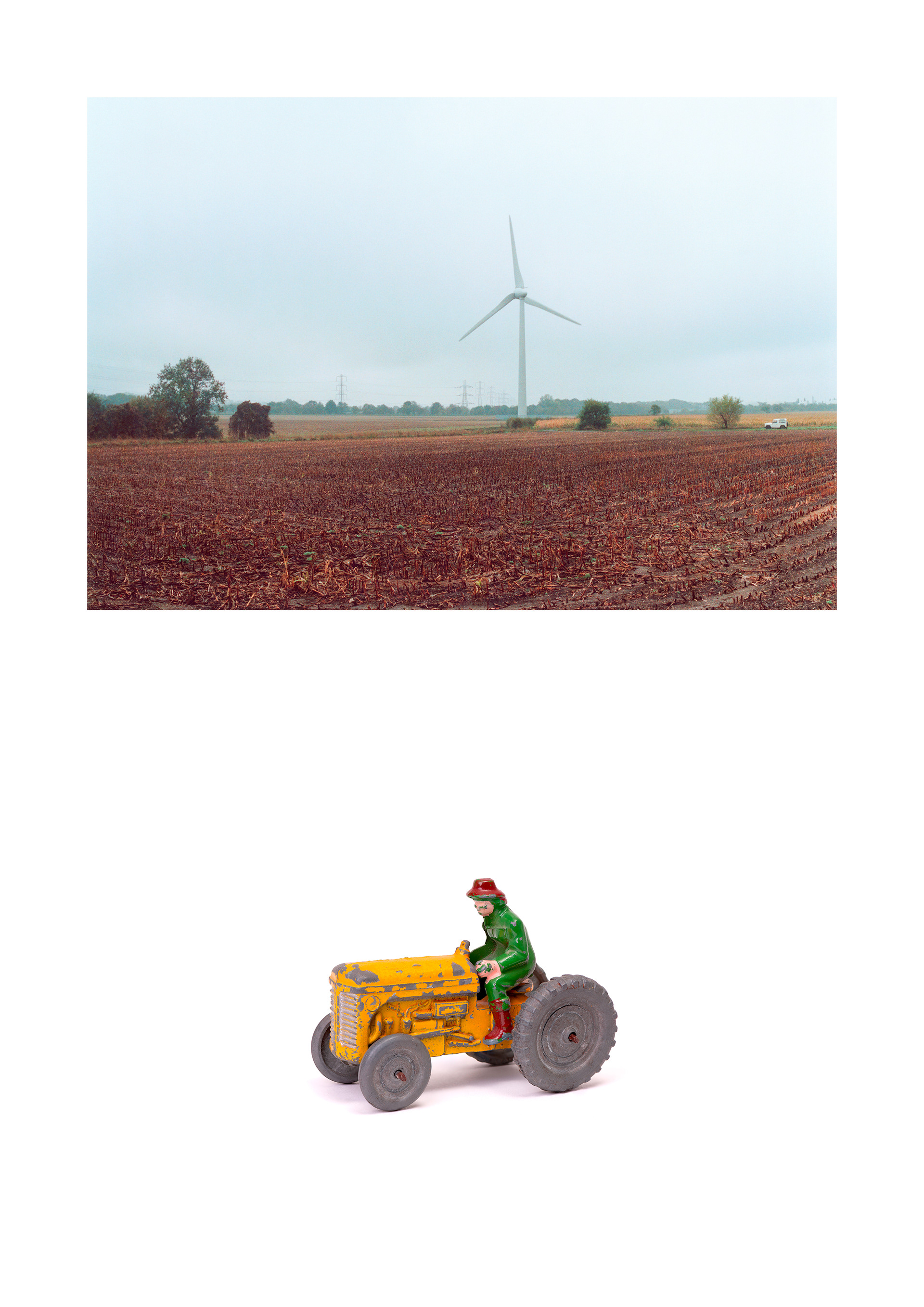
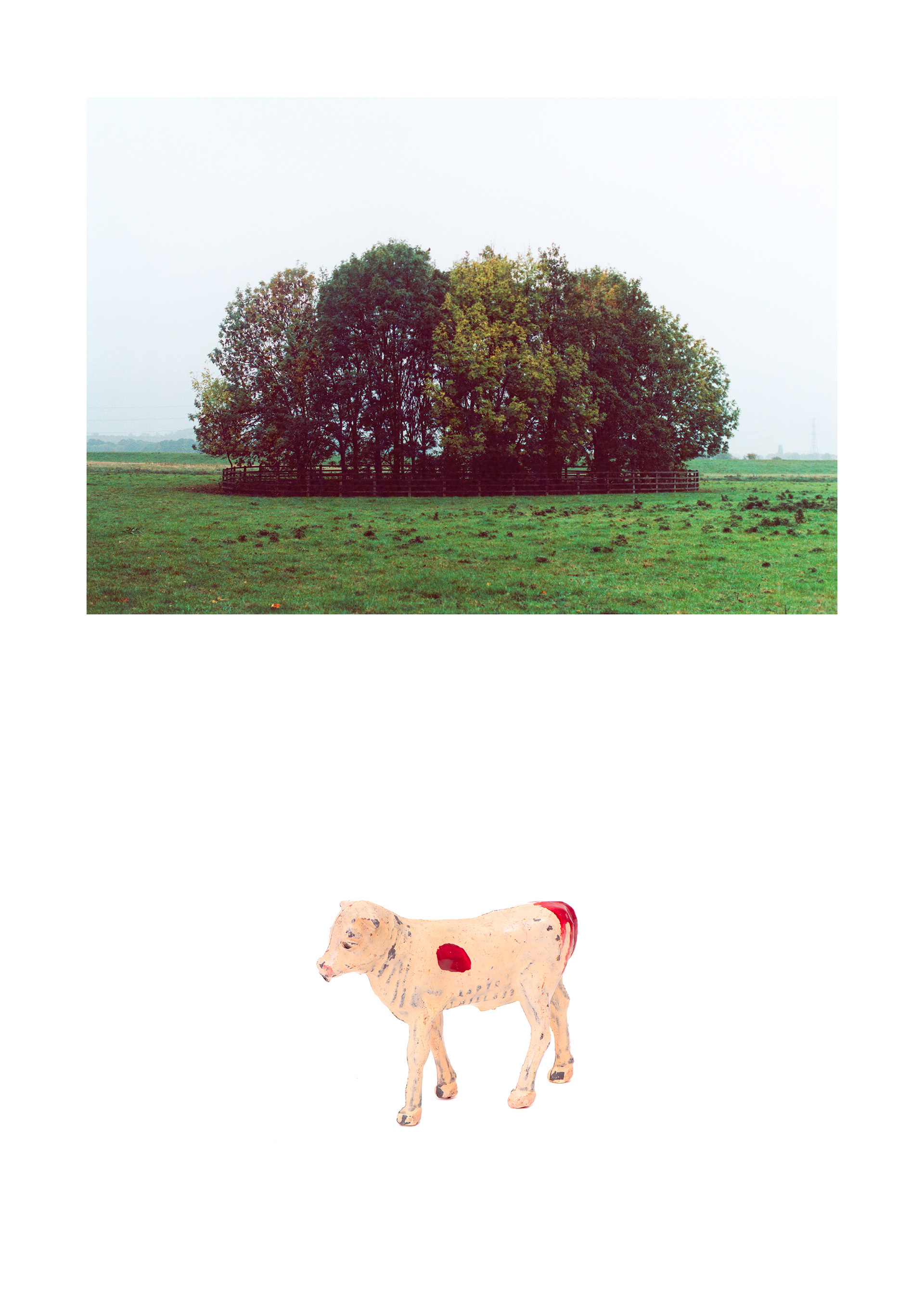
By this stage I had around 2-3 weeks before the opening of the exhibition and I needed to get something together to actually show. I settled on two landscape images of Burton Joyce which I took as my first initial walking brief at the start of this page. Along with these landscape images I decided to do straightforward studio shots of two different vintage farm toys on a white background. These toys would link to the landscape by suggesting to the viewer what the land, in each landscape, is used for. Below are the final images.
The images above simply show the layout of the images. In the exhibition they were individually framed like this image of my work in the exhibition below.
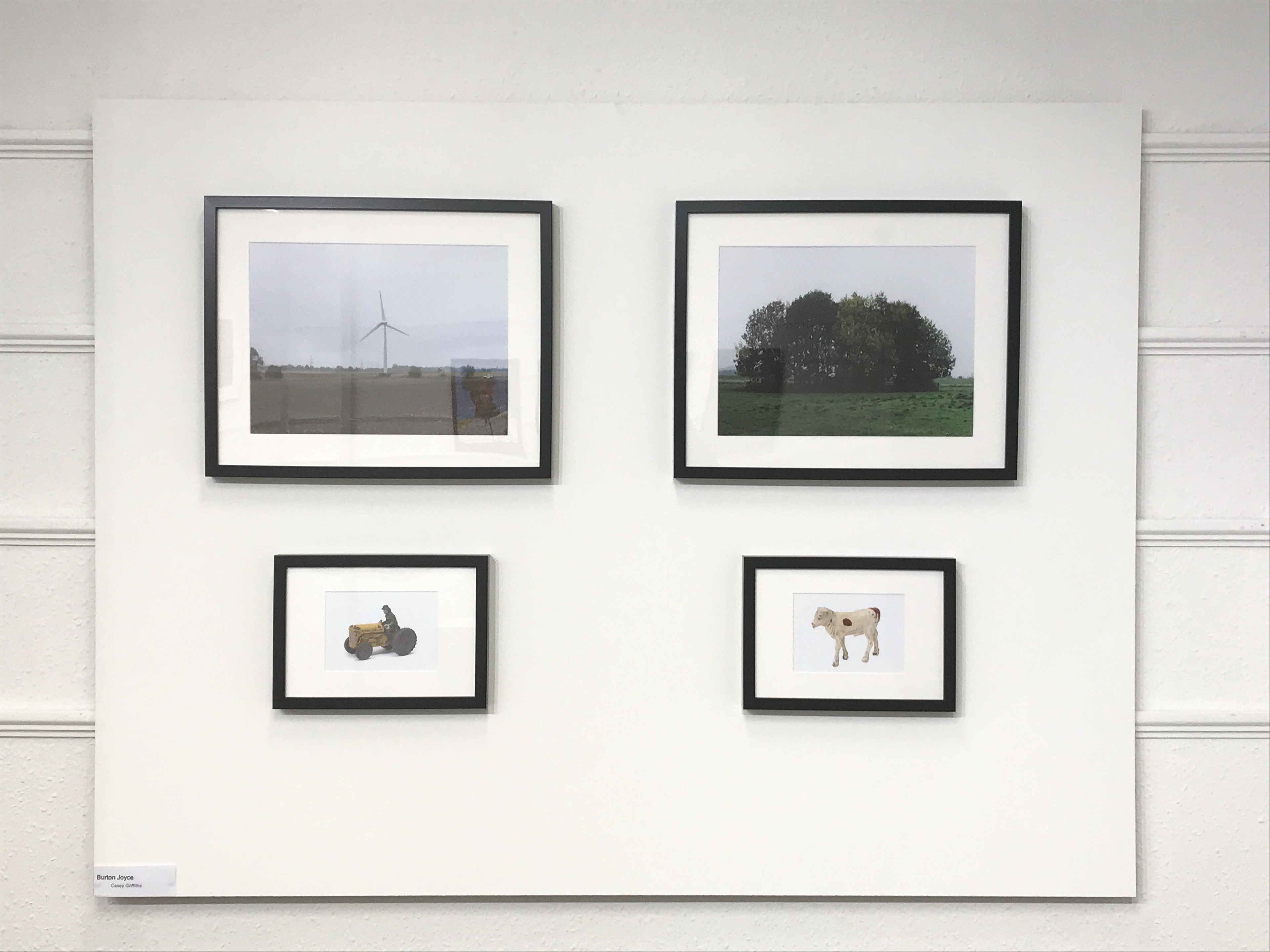
I decided to name the series, "Burton Joyce" only because it related to where the images were taken. I think the framing of the images works well as it gives differentiation between the 4 images instead of it being all on white and not seeing the edge of the studio images. I also like the edging inside the frame as it gives them a lovely separation from the dark frame as well as making the image pop out more. I also decided to mount the images to a large piece of MDF instead of using the wall hanging system in place at Nottingham Society of Artists (exhibition space).
Evaluation
The exhibition went extremely well in my opinion, especially the private viewing on the opening night. So many people showed up to view the work and it was really good to see. We had some great positive comments about the exhibition itself and individual pieces of work too.
The planning of the exhibition was a little rocky until we appointed everyone roles within the group such as social media team, marketing material team etc. Once we appointed everyone roles, we started getting some order which allowed us to get on with it. Once Neve found the space and we had it confirmed it then meant that everyone could begin creating the posters, booklets, website etc. Due to the space only being available the week before it meant we had to have our exhibition on from Wednesday 30th January - Sunday 3rd February. This wasn't a problem it simply meant that we had to have our work ready a week before the other groups.
As we were approaching the exhibition, the planning and set up could have gone a little smoother, this is because we had a core team (4 people) that stuck in till the very end working extremely hard to pull off this exhibition. The thing was that it was this core team (me included) that found it frustrating how most other members of the group did not pull their own weight, so to speak. It would have been so much better if everyone stuck in and finished everything off as a team, instead of the core team having to do the finishing touches up until 8/9pm the night before the opening.
Overall, though, the exhibition was a success and I believe it looked very professional, with all the posters, booklets, frames, name tags etc. I feel like we did extremely well for our first exhibition here at NTU. As my job in the exhibition was to create the website I feel like I did well to create a good looking and professional website. Link below.
This term I have found very challenging as the brief (Le Flaneur) was way different to the type of work I like and want to be producing. Throughout the term I have tried so many different things constantly switching from studio and digital to landscapes and film. Even though I was unsure of what I wanted to curate for the show, I still carried on making work whilst I decided as it meant I was still trying out ideas that fitted with the brief. However most of the things I shot, in my opinion, did not fit very well with the brief so I had to go back and use something I had already done and maybe link it to another image to create a little narrative between them. This is where I used the toy farm animals to link the landscape to the object.
Next time I do an exhibition I will definitely make sure that the people I work with can pull their own weight and work all together as a collective to get the exhibition on track early instead of leaving things till the last minute. I will also make sure we are more organised and try and secure a space early on.