This project is to create a photo-book. I find this an interesting project as I have never created one using my own work before. To begin with I looked at Love on the Left Bank by Ed Van Der Elsken. I liked this book because it demonstrated such a range of page layouts using image grids, full page spreads, image and text and also blank spaces. I felt that the images had a cinematic aesthetic to them which may be down to the tones of the images I'm not sure. Overall I quite liked the layout and look to the book.
Love on the Left Bank – Ed Van Der Elsken:
- The book was originally published in 1954.
- It had been reprinted by publisher, Dewi Lewis.
- It is based around a fictional female named Ann and a story about her living in Paris.
- Van Der Elsken follows her around as she works as an exotic dancer, drinks, flirts, fights, sleeps, falls in and out of love.
- Within the book Elsken uses text and images to create a narrative between them.
- The text in the book is actually the voice of Manuel, a young Mexican who falls forAnn.
Layout:
- The layout of the book changes throughout
- Full size images that fill the page
- Some images take up a double page spread
- There are image grids
- Image and text alongside each other
- Some pages just have text on
- Some images have a little description
The Series:
- The book acts as a narrative created in relay between the image and the text.
- Both image and text can standalone to carry on the narrative but by having them together they solidify the story of Ann and Manuel.
- The images have a cinematic aesthetic to them which also adds to the narrative.
- To me it feels like a film. I can imagine each image as a film still which in a sense makes the narrative stronger as I would read it as a movie sequence.
Other Points:
- The book is also stitched together which gives it a more personal feel.
- I feel that because all of the images are black and white it gives the entire book a certain aesthetic and timeless quality.
- I really like how some of the images have white space around where the viewer can ‘rest’ their eyes.
- Other images are full size edge to edge on the page which really immerses the viewer in the image and makes the images more intimate.
From looking at Love on the Left Bank, I decided to go out and photograph a well-known building in Lincoln. I knew this building had negative connotations surrounding it to certain people so decided to focus on that atmosphere and experiment on putting text with it to solidify the atmosphere. Below is the sequence I chose.
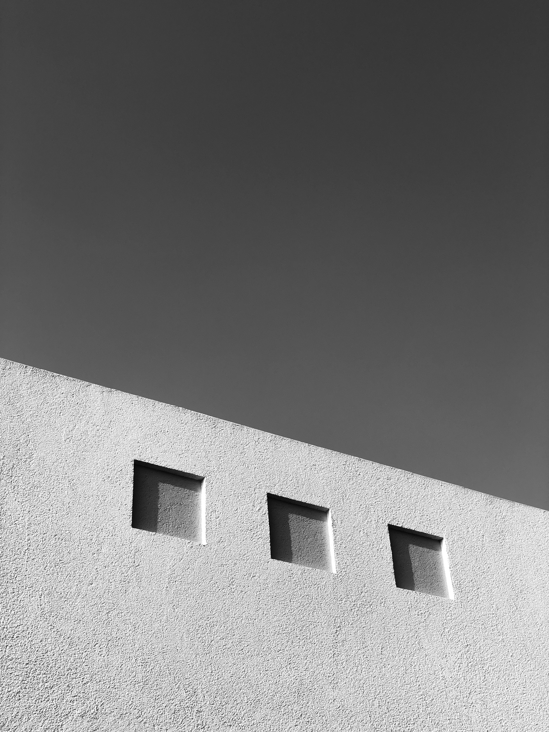
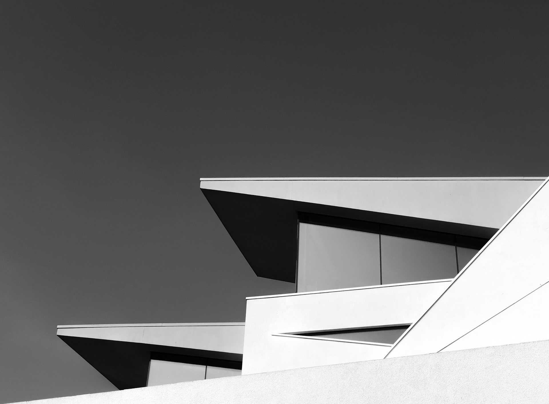
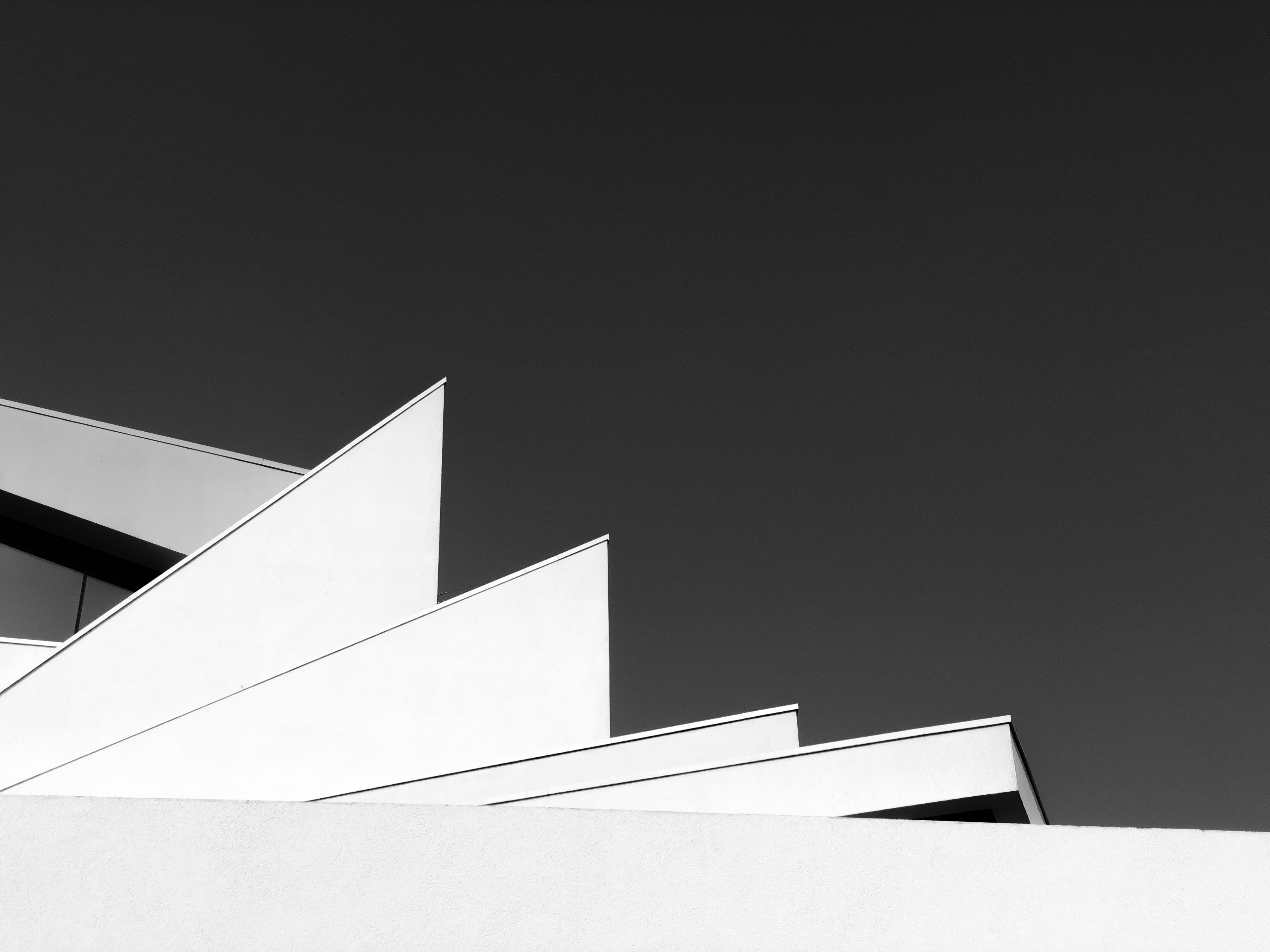
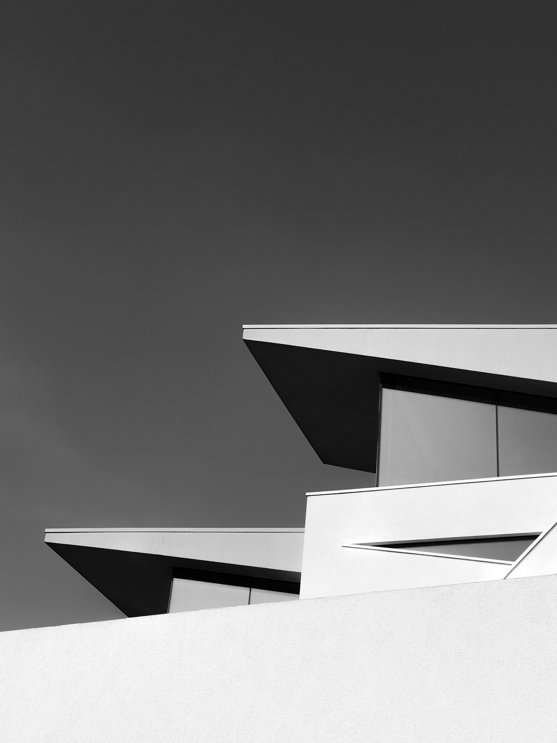
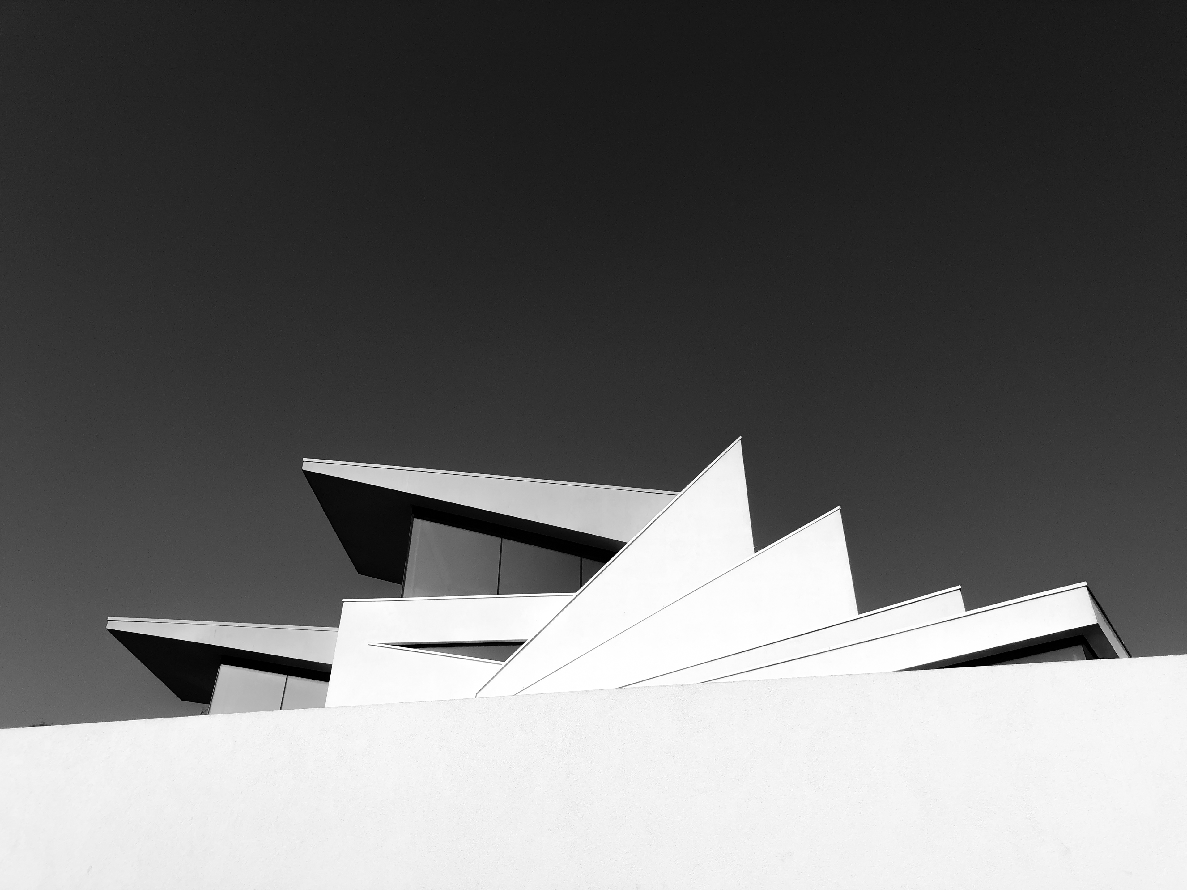
I decided to have the images in black and white as they had a greater impact on me visually and it made it more visually appealing to me.
After this sequence, I went online and researched the house a little more. I found that the design of the house was inspired by the Strelitzia which is a South African plant known as the Bird of Paradise flower, which means joy. They are predominantly yellow in colour. During my research, I also found out some information about the workers that worked on the building and how they seemed to have been 'cursed' by the building. The owner stated that the building company went into administration first, followed by the renderers, then followed by both window companies. To top it off the owner then stated that the two men that built the stairs also died shortly afterwards.
I found these stories extremely interesting so decided to create a zine from these images and the have quotes from the people that found the building negative together with the images. I created the zine in InDesign as it is a quick, easy and simple way to create one.
I have made two versions of the Strelitzia photo-book. Version 1 was almost like the draft, had a very simple and boring layout that repeated throughout the entire book. Version 2 is the final version with different layouts such as blank pages, double page spread and image on the right, text on the left etc. I am very pleased with how the second version came out as I think it works well as a photo-book, incorporating white space into the design for viewers to rest their eyes. I think that the images work well with the text to create a dark and negative atmosphere around the building. I found that the position of the text on the page can change the way you read the image as the space between the text and image can sometimes be distracting depending on where on the page the text is.
Love on the Left Bank was a good example of image and text working together to tell a story and creating an atmosphere that goes along with the story of Ann and Manuel.
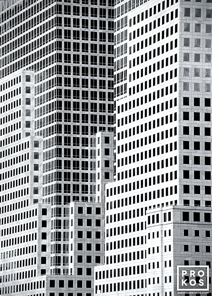
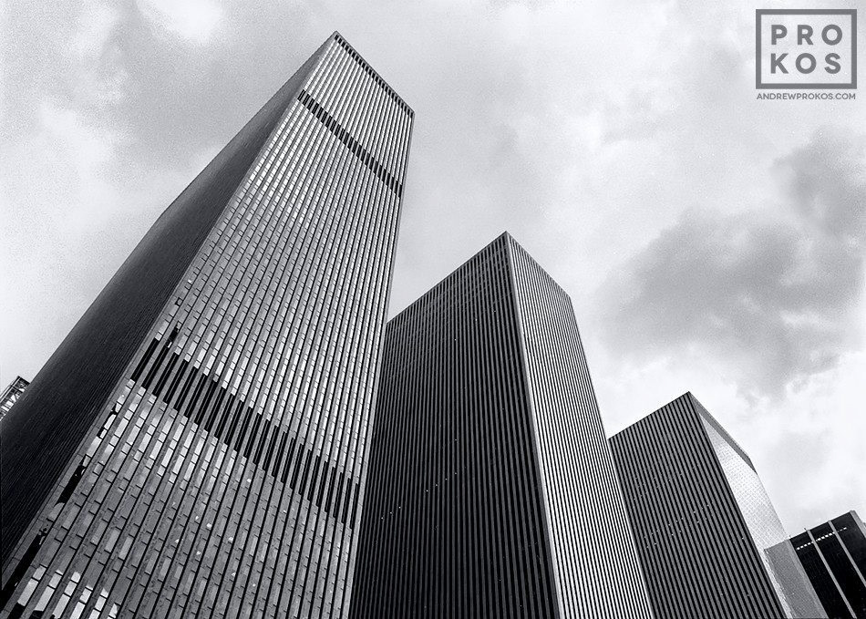
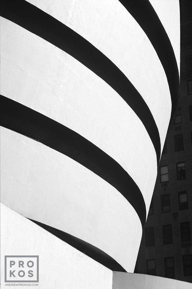
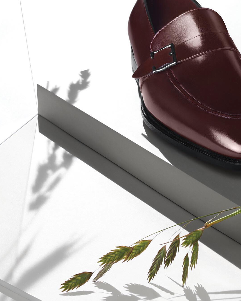
Artist Research - Andrew Prokos
Andrew Prokos is an architecture, fine art and advertising photographer based in New York. His images are of New York architecture in high detail black and white, capturing new views of iconic buildings around the city. I like his work as it focusses on details, shapes, shadow and texture within architecture. They are very interesting images and I took inspiration from his work when taking my images of the Strelitzia house. Below are a few of his images.
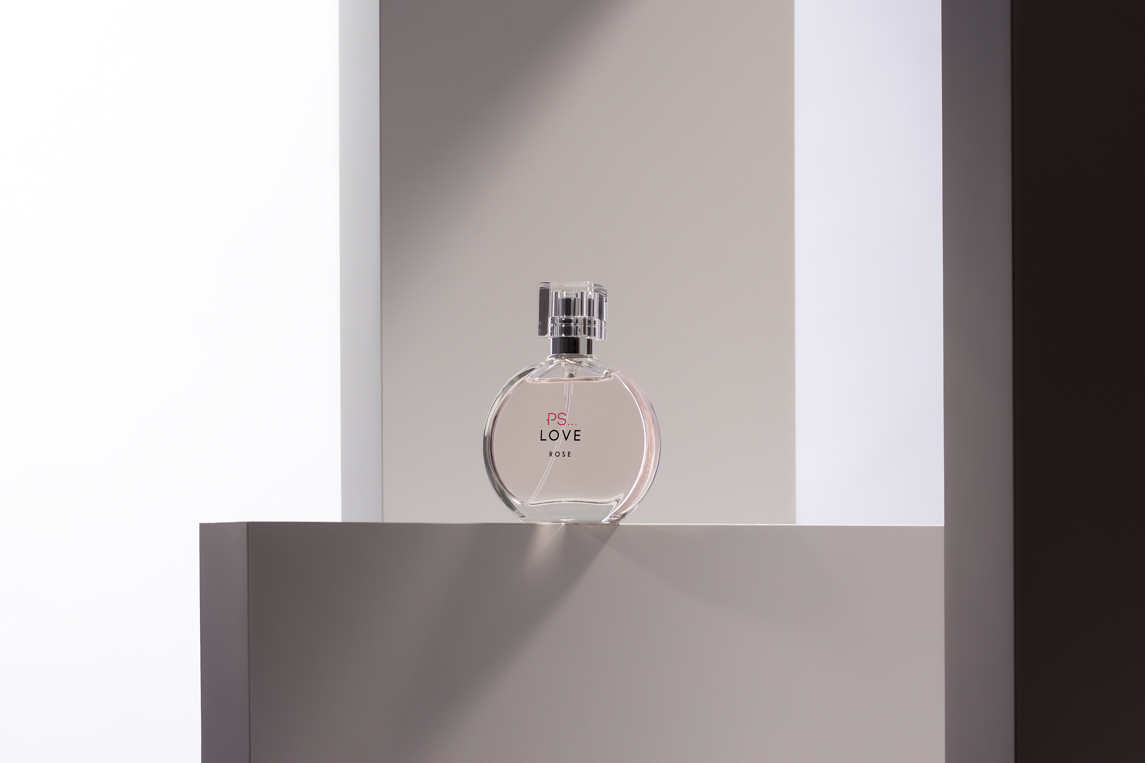
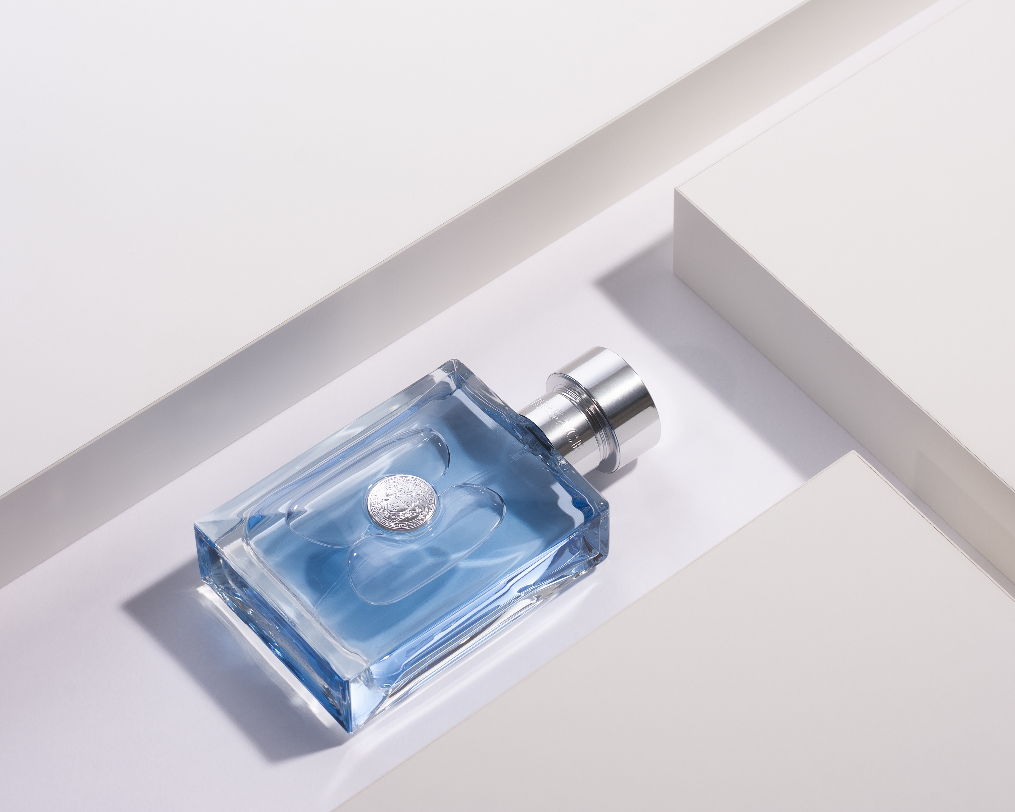
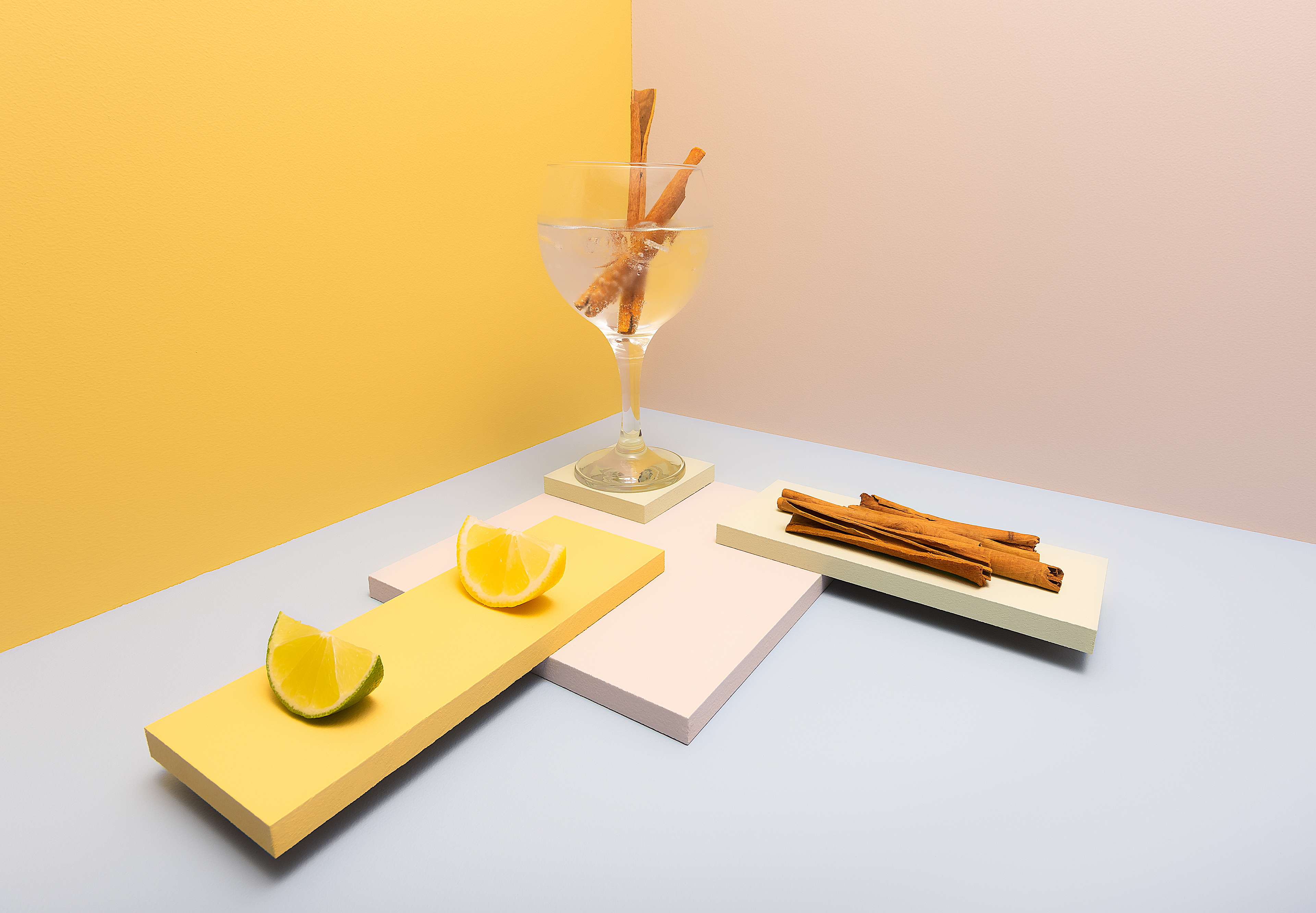
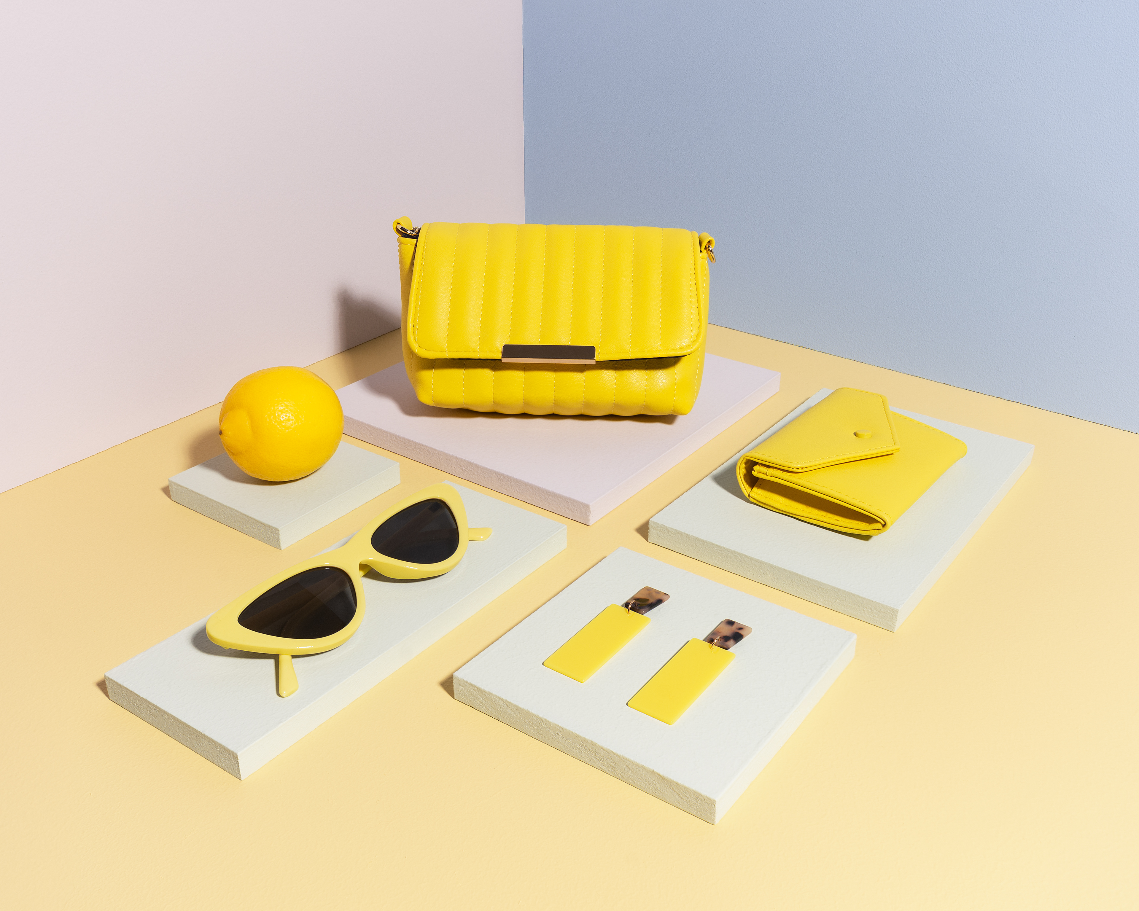
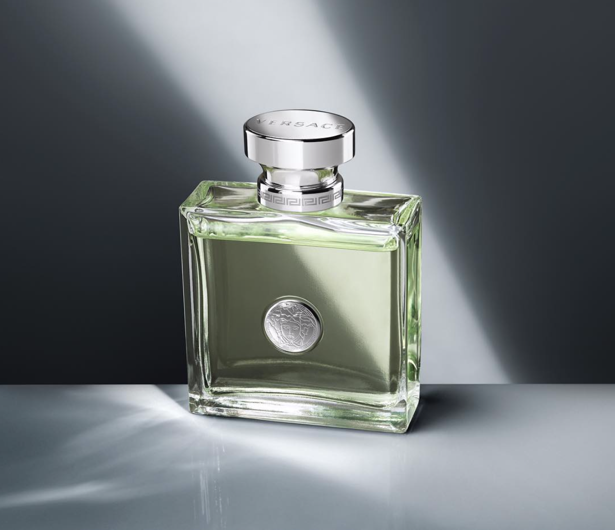
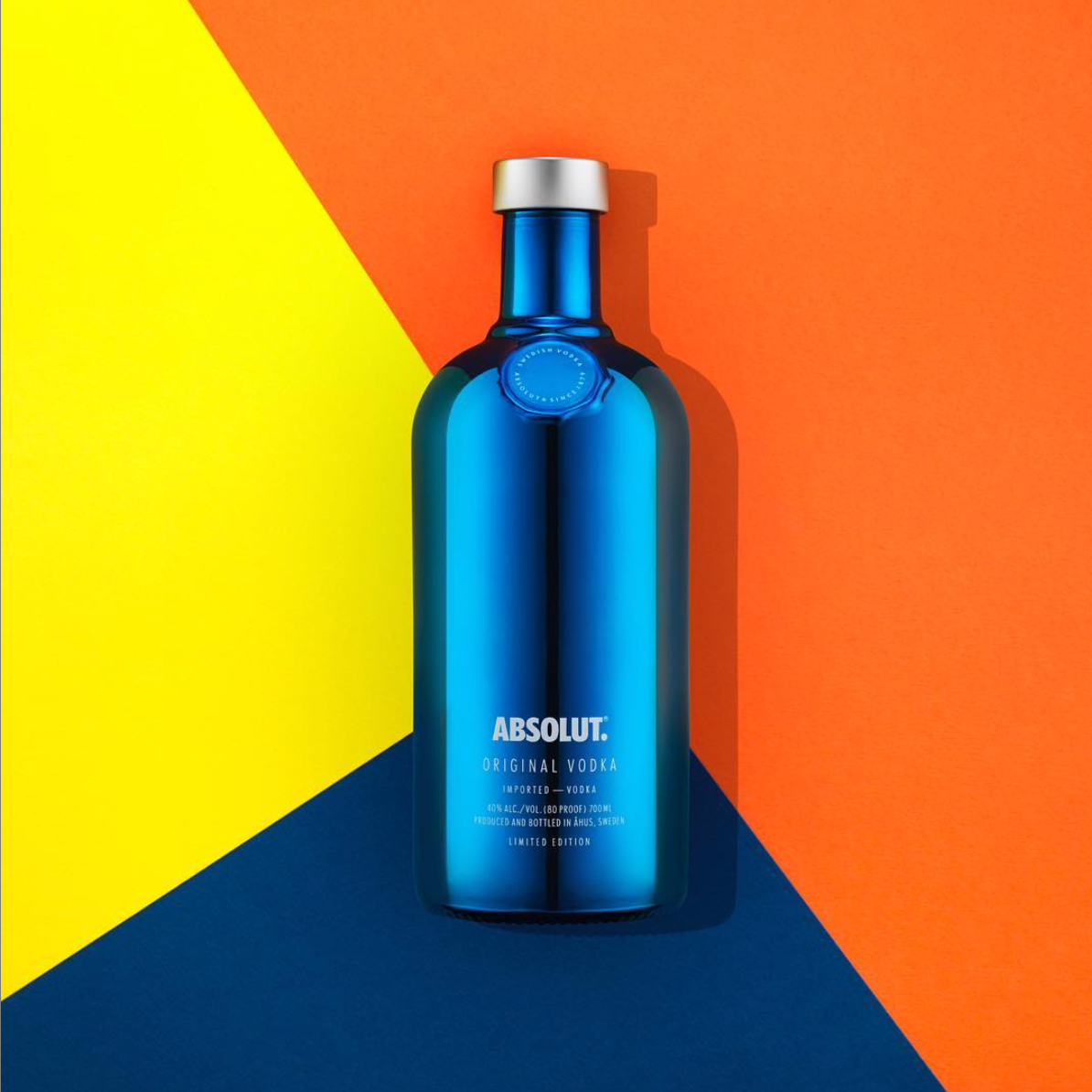
After my Strelitzia photo-book, I wanted to create a book that incorporated work that I find interesting and fun to create. These images are advertising and product photography. I really enjoy creating these images as they take a lot of time and effort to get them looking right as lighting is key. I decided to take some images I had previously taken as well as some new fresh work and turn them into a zine which looks at how contemporary advertising and product photography uses signs and visual language to make products appear more appealing and perfect-looking than they actually are. Below are the photographs I have used in this new zine.
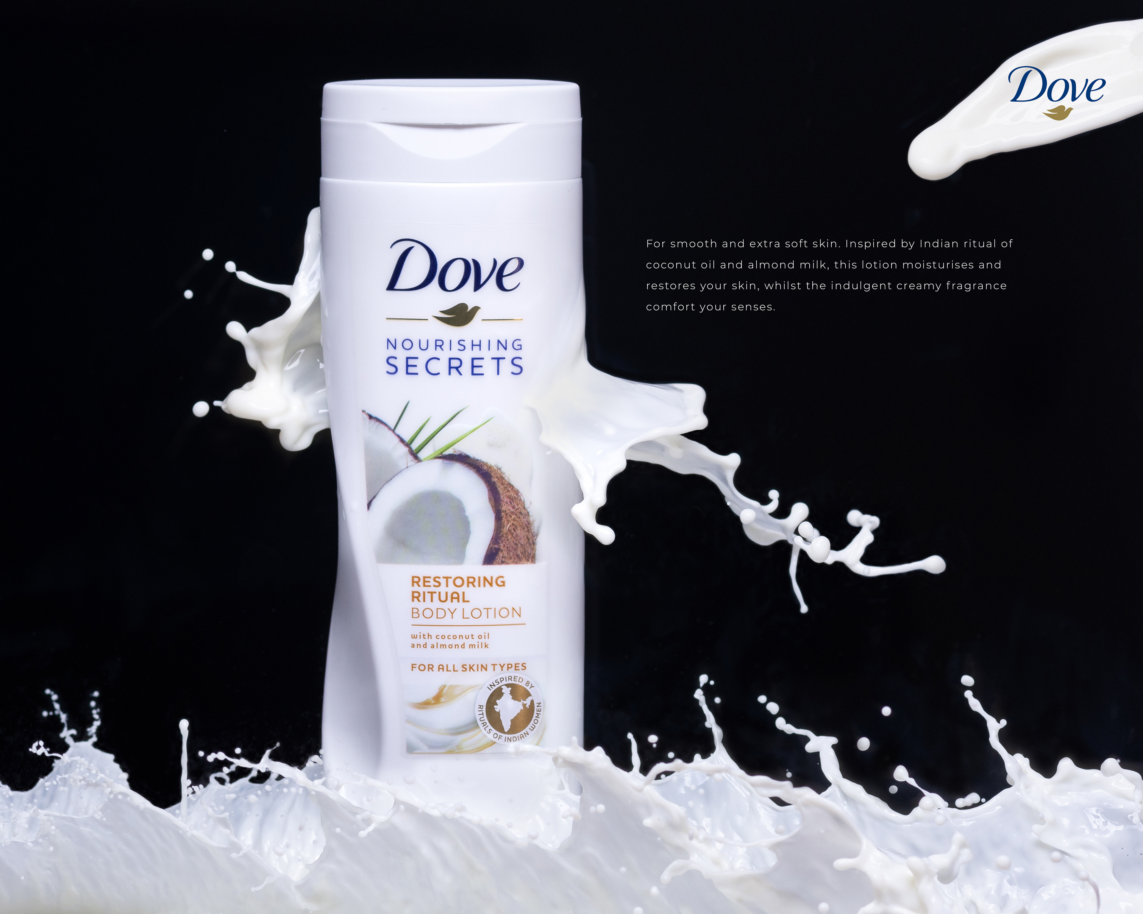
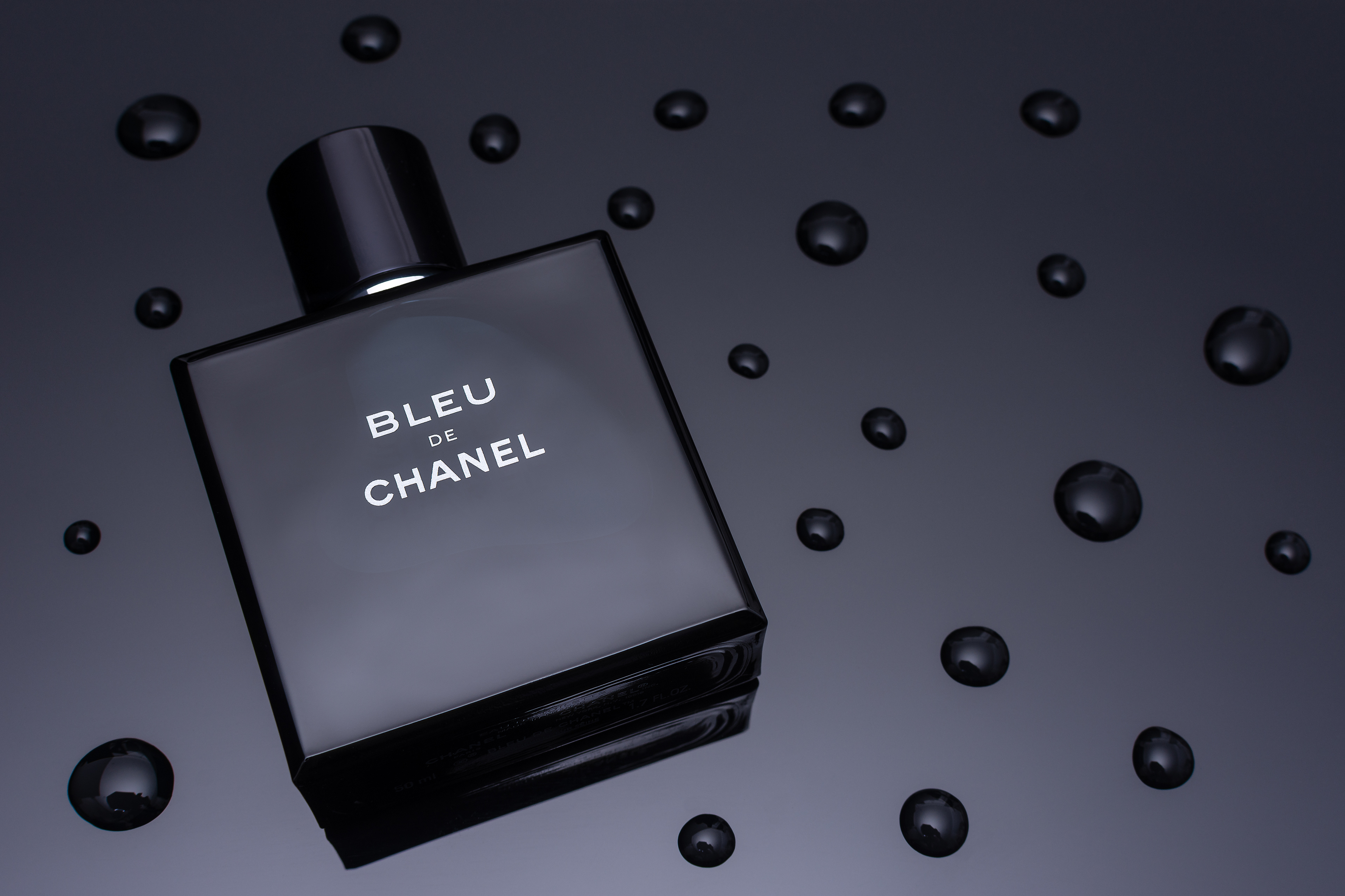

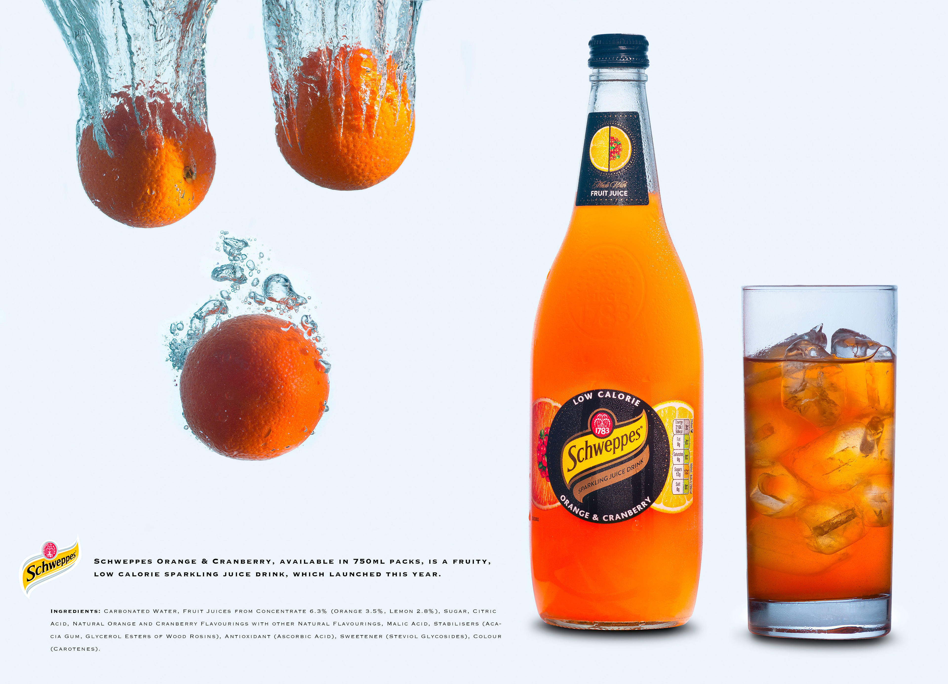
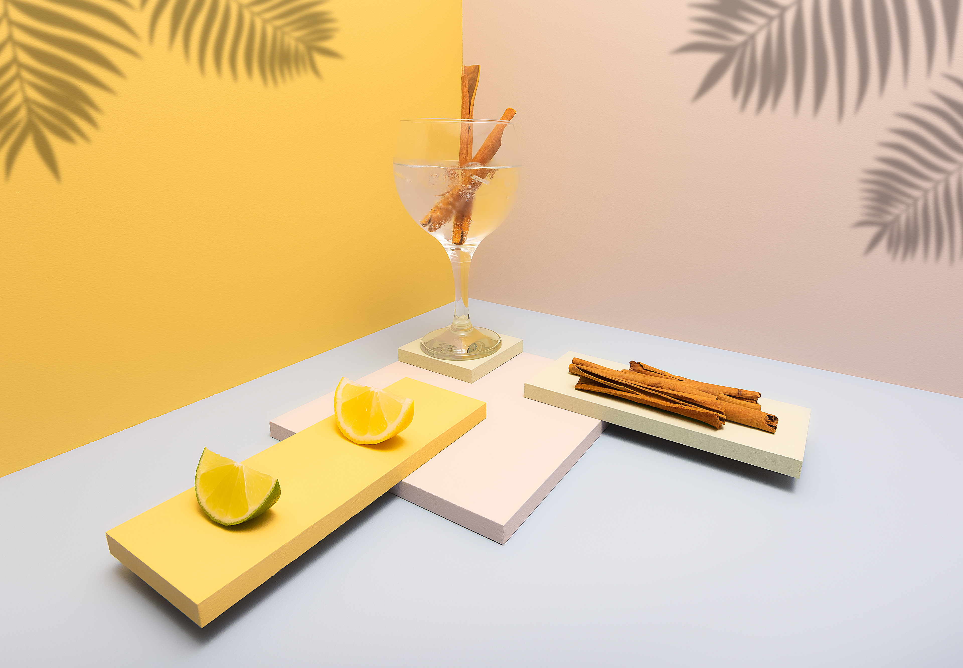

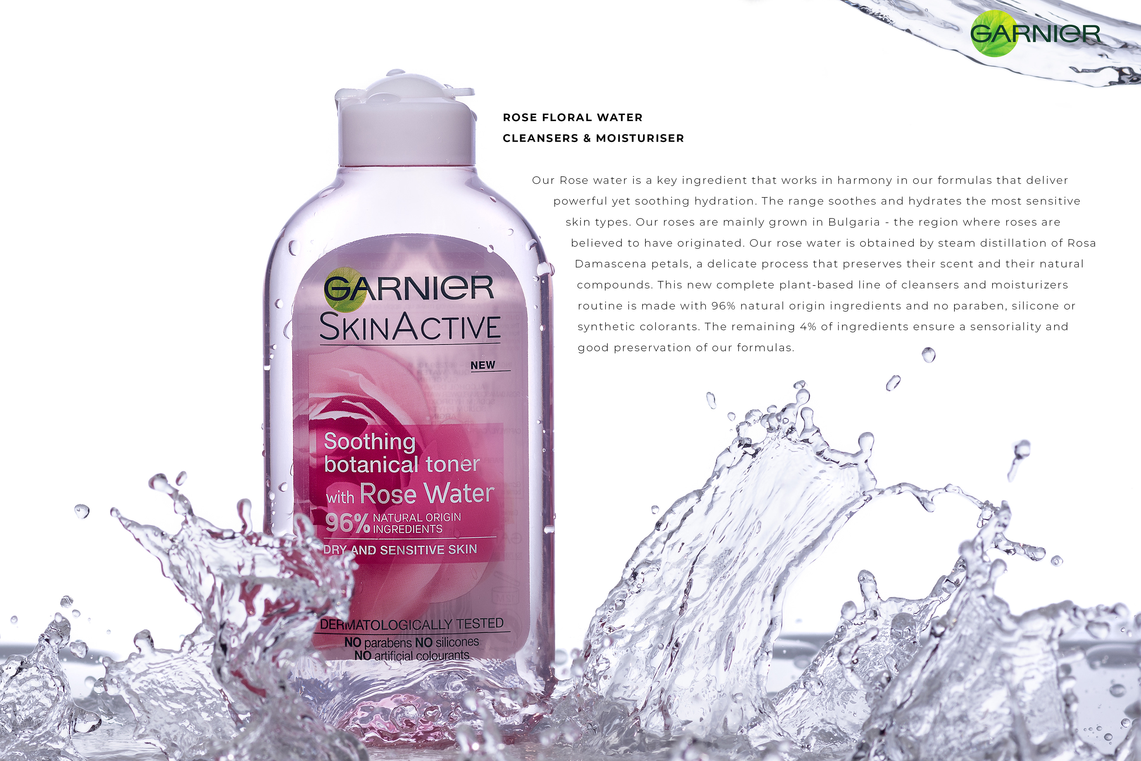
I made this zine because I wanted to see how I could use this work in a photo-book format to see if it would work. So I played around with colour and colour connotations in the final book to try and create a sense of how real advertising works to capture our eyes and draw us into their products. I decided to use a coloured square on each page and colour them with one predominant colour from the image it is on the page with, to create a more interesting and eye catching layout and design. I then added a few words on these coloured squares to describe the connotation of that colour to me.
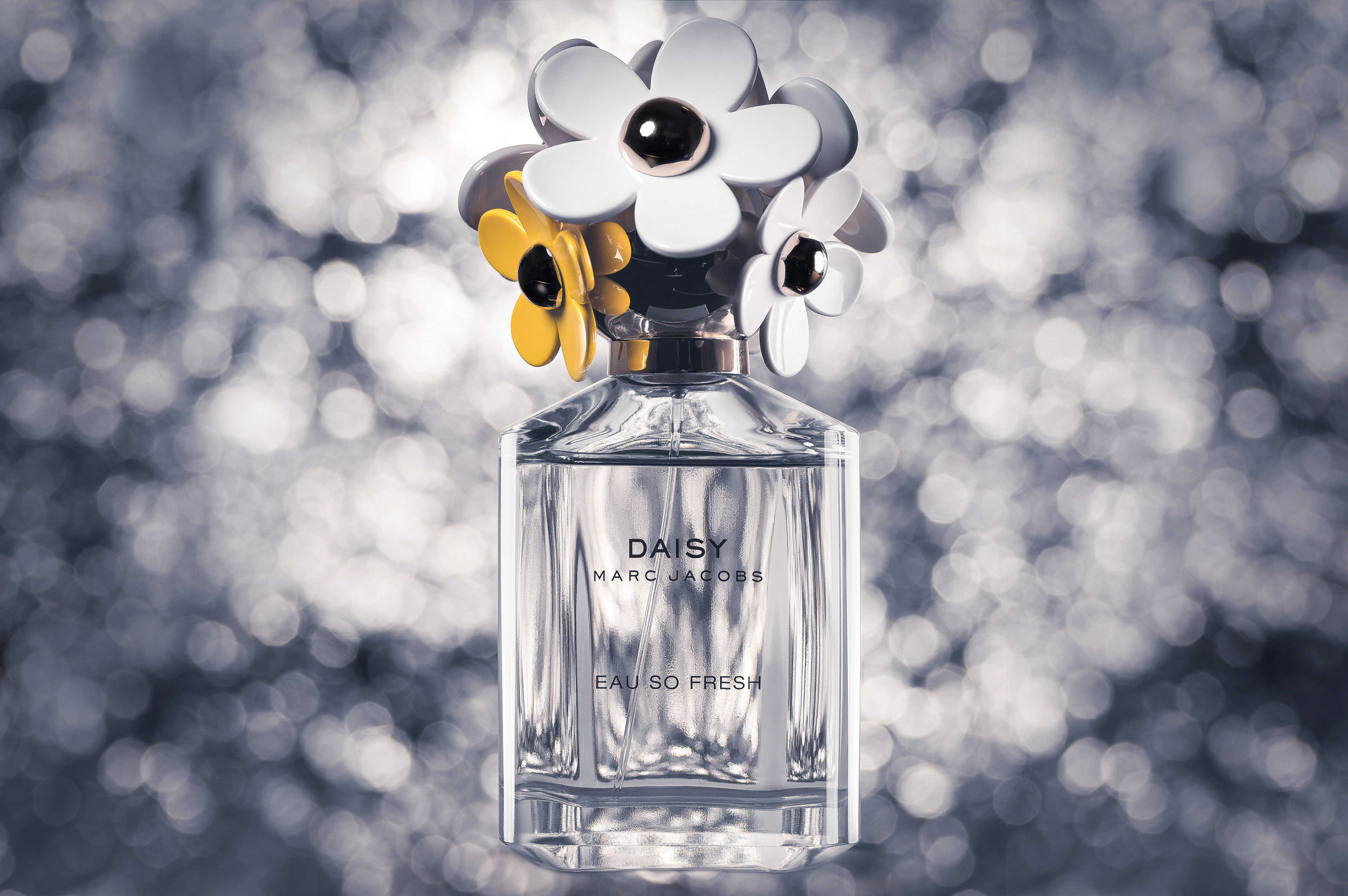
Once I had this zine completed, I decided to create one with just new work. I reduced the number of images as I didn't have enough time to create 2 more images, as the shoots take a lot of time to set up and plan as well as hours in post-production. Below are the new images in the second version of the zine. I decided to name the zine 'The Rhetoric of Advertising', because the word 'rhetoric' means language that has a persuasive and impressive effect. Below are the images in the second version of The Rhetoric of Advertising.
Overall, I do like this zine but in my opinion the Strelitzia zine works far better as a photo-book and a series than this one. This is because the images in the Strelitzia zine have a uniform look to them and are shot in a sequence which solidifies the entire zine together with the text. The layout and design is also far better in the Strelitzia one than this advertising zine because it incorporates different page layouts throughout the book such as double page spreads, single image on right and text on the left as well as blank pages where the viewer can 'rest' their eyes.
Artist Research - Packshot Factory
Packshot Factory are a team of creative individuals from photographers, retouchers and art directors, based in London. They work on shoots for companies all over the world and work both in film (moving image) and photography. Their work is focussed on advertising material for TV, billboards, social media and anything else an image can be put on to help market and promote a product. I love their work because it has such a high-end look and I hope to be doing similar work in my future career as a photographer. Below are a few of their images.
This project has helped me develop my ability to sequence images and create series. It has helped me edit down images and develop my technical ability to create zines. It has helped me develop the confidence to create a small book out of my work and be able to see my work differently when it is in a sequence. I have enjoyed certain aspects of the project such as seeing my work develop into a book and the physical element of putting a book together. This project has also helped me develop my ability to pair text and images together to create a more impacting piece of work with more 'meaning' than just the visual elements of the image/s. I will continue to make zines for my own personal projects and experiment with using different materials and paper types as well as other formats of creating them.